Use Icons to Turn a Mind-Numbingly Boring PowerPoint Presentation into an Awesome One
If you are reading this blog post, chances are you (and your audience) have been a victim of one or more mind-numbingly boring PowerPoint presentations. You know, those presentations where you have slide after slide of nothing but bullet points.
Besides being incredibly dull to look at, when you have too much text, your audience ends up reading far more than listening and eventually they may tune you, and your important message, out completely.
Are you nodding your head right now? Well, have no fear, because we are about to show you how simple it is to add some icons to your presentation to turn it from ho-hum into awesome.
Why Icons?
Human beings are visual creatures. We were drawing images on cave walls way before we were writing words. At this point in time, love of imagery seems to be in our collective DNA. Your audience will be far more engaged if you give them images to look at in addition to text.
Second, icons have the ability to take a concept and reduce it into a very simple shape. When we see an icon, our minds instantly translate the icon into what it is representing. It is almost as if we do not see the shape, so much as immediately understand what it means.
When we see a sign with a yellow triangle and interlocking circles, we are not really seeing those shapes so much as instantly understanding that something in our environment is very dangerous, perhaps even deadly. This is powerful communication.
The use of icons will help your audience focus on your message and get the full meaning of what you are trying to convey. Wouldn’t you rather your audience be engaged and hear every word you say instead of bored and playing Candy Crush in their phone.
Check Out the Difference
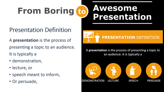
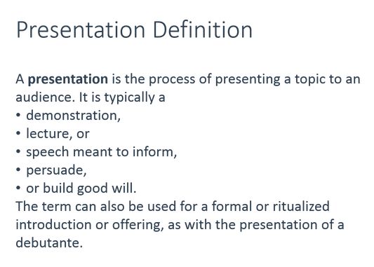
Take a look at these two slides and tell me which bores you to death and which is, if you don’t mind me saying, pretty darn awesome:
THIS?
OR This?
Why Icons Over Photographs?
You may be thinking if icons are so great, then photographs must be even better. After all, isn’t the saying “A picture’s worth a thousand words?” The thing is, photographic images often contain extraneous information that can distract your audience. This is why images are often cropped when used in advertisements so only certain information is conveyed.
Besides being incredibly simple and giving the viewer ONLY the information they absolutely need, icons are effective for a few other reasons:
Universality – No matter what language your audience speaks, icons are universal and can be understood by pretty much everyone. This is incredibly helpful to those speakers who often give presentations in front of international audiences.
Work on All Screen Sizes – Because icons are still highly-effective even when very small, they can work on screens of all sizes.
Small Files – As mentioned previously, photographs tend to have a lot of extraneous information, and all of this “extra data” takes up precious storage space. Because icons are typically small files, they don’t take up much storage space, which is incredibly helpful when using smaller devices to launch your presentation.
And speaking of icon files, they come in many types, but you will want to look for ones in the vector format that are highly customizable that allow you to easily modify colors, add your own text, re-size and move the shapes and icons of each slide any way you need them.
How to Choose Awesome Icons
Great, so now you’re 100% completely on board with using icons in your PowerPoint presentation. You know why they are effective and popular and what size and file formats to look for. Now all you need to know is how to select the right ones that will make your presentation awesome. Here are a couple of tips to help you do just that:
Think Outside the Box
Using icons instead of text is a step in the right direction, but make sure you think outside of the box and don’t use typical icons that every other business presenter out there is using. Remember, you’re trying to engage your audience not bore them to death.
Here’s an example:
Here is a typical icon to illustrate teamwork. Sure, it gets the job done, but many other presenters will have used a similar icon to represent teamwork.
So, why not think outside the box and use something totally different that still represent the same concept. Something like:
This grouping of trees is visually much more engaging and different so it will capture attention. Like organizational team members, the trees are all different yet alike in some way. And, like trees in a forest, they are all part of the same ‘ecosystem’ working together to keep that ecosystem thriving.
Keep Your Style Consistent
Just as you don’t want to use 15 different fonts within your presentation, as that will make it very busy and hard to follow, you also don’t want to mix and match your visual styles too much. For instance:

If you’re going for a sleek and professional business presentation, then…
Don’t suddenly have silly emoticons to illustrate a point.

Once you get the hang of finding, uploading, and editing icons within your PowerPoint slides, you’ll actually start having fun creating your presentations. If you actually have fun creating your presentations, your audience will feel that and have fun as well. Who knew awesome could be so easy?


Nice Post. Even i like to use simple icons instead of colorful images.