
No matter in which profession you are, you might have attended several presentations. Of course, we tend to remember the best presentations for a lifetime, but what if we ask you to recall the worst presentation (which was a complete visual mess) you ever attended? Well, we understand how disastrous it would be for you to be a part of such a presentation!
Indeed, an image is worth a thousand words; however, it may make or break your presentation. The authentic and compelling images let the audience retain and interpret the information without overload and build the professional credibility of your brand/organization. Contrary to this, copyright and pixelated images can create a mess for your audience, which they won’t be able to decipher easily. So, as a presenter, you need to be wise and thoughtful while selecting visuals for supporting your content.
In this blog post, we have provided the best practices for using images in your next presentations. Read on!
Visual Aspect – Do’s and Don’ts
Sometimes, in an attempt to make more creative visual slides, we unknowingly come up with unique ways to kill the fun and elegance of the presentation.
Here are some do’s and don’ts to keep your slides visually engaging.
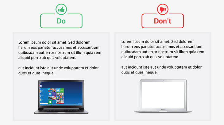
1. Use visuals that accentuate and support your content and the key points. Avoid using images that overshadow your core message and distract the audience.
For example – If you are talking about a particular series of Windows phones in your presentation, include the images of that Windows phone series only instead of any other series.
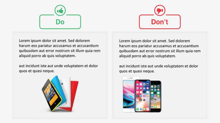
Similarly, if you are talking to a specific brand, don’t confuse the audience by including the images of other brands. For instance, if your presentation is about Microsoft Windows, don’t include images of the Apple Notebook in your slides.
2. Use high-resolution and quality visuals that can be resized to fit your screen without pixelation. Don’t use stretched, distorted, and blurry images, as it will only leave a negative impression on the audience and tarnish your credibility.

Useful Tips:
- Standard resolutions for the screen are 1920 pixels wide by 1080 pixels high. Ensure your image has at least the same dimension.
- There are several websites that offer a wide range of professional and high-definition images; you can use them.
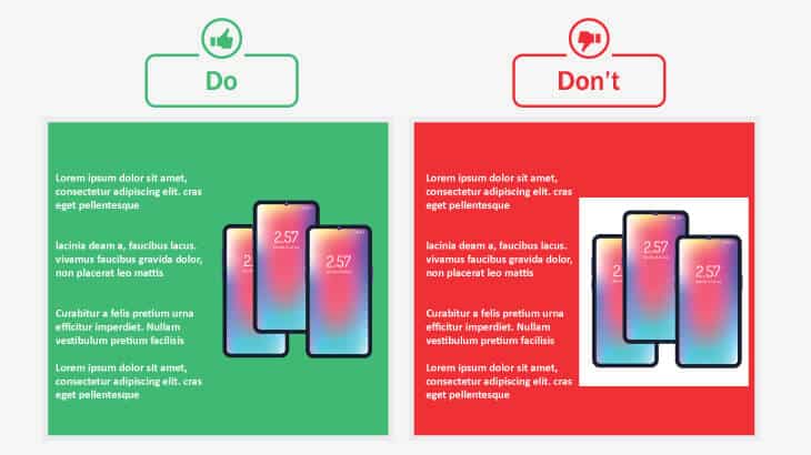
3. Use one relevant image in a slide to avoid clutter and maintain minimalism. Refrain from using too many photos in a single slide to make it distracting.

Useful Tips:
If you want to use multiple photos in a single slide, then:
- Crop the images to a similar shape or size.
- Group and align the visuals in a consistent manner to increase scannability.
- Fit different-sized images into a cohesive shape and neatly aligned grid.
4. Maintain consistent tone and aesthetic quality of images if your presentation emphasizes a single overarching message. Do not use inconsistent images that look too dissimilar and ruin the overall tone and theme of your presentation.
5. Choose sleek, modern, polished, and visually consistent visuals. Evade using outdated clipart from the web.

6. Maintain diversity in images to represent a broader aspect. Don’t use images that show only a specific section of the broader aspect.
For example – The images on the left side better convey the concept of empowered women.

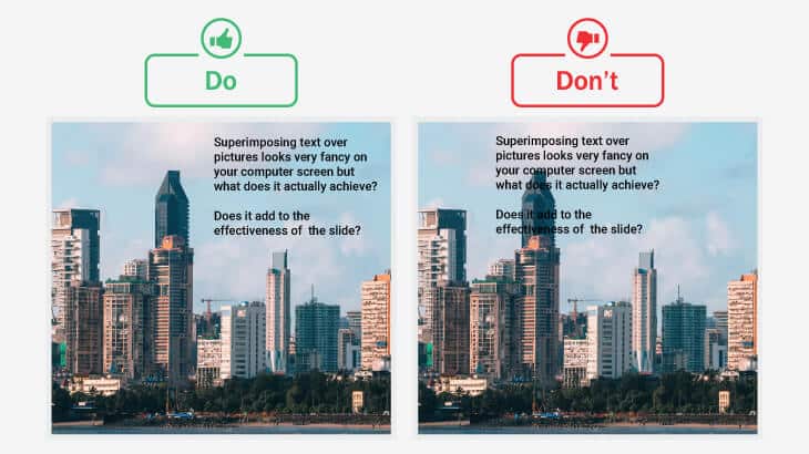
7. Use simple images that maintain the readability of your slides, giving your textual information enough white space. Refrain from using visually busy images that destroy the complete readability and impact of your presentation.
If you want to add text to the image, place it in such a way that the viewers can easily notice and read it. Avoid covering important aspects or people’s faces with text.
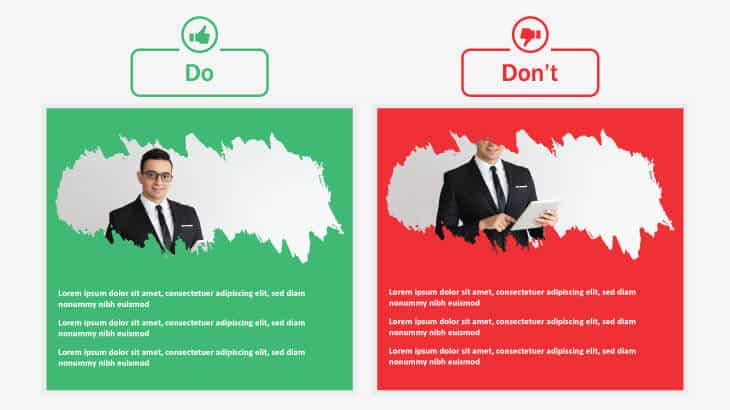
8. If you have lots of text to represent, use half the space of the slide for text and half for the image. Shun using images in a small space for the sake of highlighting the text.
9. Use images with a sophisticated background that soothes the eyes of the audience. Avoid using images with headache-inducing backgrounds.
10. Use images that are relevant to the context. Including out-of-context images will only confuse the audience and make it difficult for them to relate to your content and message.

11. Be careful while flipping or rotating the images. Consider all details to avoid any mistakes.
For example – In the below image, the alphabet “F” on the cap indicates incorrect flipping of the image.

12. While cropping the images, ensure that the size of the main objects looks similar, giving the overall image a consistent look. Don’t enlarge or zoom in an image, as it will reduce the clarity of the context.
For example – The image on the left side indicates cropping-gone-wrong as it is difficult to understand that the context is about numbers, statistics, or finance.

Legal Aspect
Most presenters pay more heed to non-legal aspects of the presentation, such as content, design, and images, completely overlooking the legal aspects, i.e., copyright issues. If you want to make legal and ethical use of images in your slides, you must care about copyright.
Here are some do’s and don’ts for legally using images and visuals in your slides.
13. Purchase the image to get rid of any awkward situation during the presentation. Don’t use copied and watermarked images.

14. Know the assignments (i.e., permissions) and terms of the license before using an image. Do not rely on prior copyright permissions as they may not be applicable to the current presentation or situation.
15. Seek specific permission from the copyright owner to make any sort of changes to the original image. Avoid recoloring, cropping, or making other manipulations in the original image without permission from the copyright owner.
16. Go through the terms and conditions of the Creative Commons (CC) license to make sure your use complies. Refrain from making unrestricted use of images with a Creative Commons (CC) license.
17. Provide credit to the image owner or provide a link to the original image source. Using visuals without giving credit or image source is not a good practice.
Concluding Thoughts
Drawing the audience’s attention to your slides via images is one thing, but creating images from scratch or using the already available images legally is another. In an effort to add aesthetic appeal and meaning to your presentation, ensure that you are not committing any big blunders while using images. The above-mentioned do’s and don’ts will help you avoid all image-related issues in your presentations and boost your reputation as a presenter!


