The power of visuals can be established by the fact that 40% of people respond better to images and visuals than plain text, and visuals transmit 90% of the information to the brain. When it comes to eLearning, the role of visuals gets pivotal as different learners have different learning capabilities. Areas where words fall short, charts, graphs, and videos take over the reins to eliminate confusion and impart knowledge to the learners in an understandable manner.
The aesthetically-pleasing designs and enriching graphics have some charisma that pulls the attention of the learners. If these visuals are used wisely while crafting the eLearning courses, they can make students and learners want to learn more.
So, if you are planning to prepare an eLearning course for corporate or academic purposes, and want learners to invest and give their valuable time in it, consider the following tips.
9 Useful Tips for Creating an Engaging eLearning Course
1. Design Should Not be an After-thought
Unlike traditional classroom training, eLearning is self-paced. So, the design is an incredibly important factor to consider for adding context and depth to the eLearning courses. A well-designed eLearning module establishes a relationship between ideas and the topics discussed, improves readability, and increases understandability even for highly technical and complex topics.
- Make a difference by using animation effects.
- Keep the fonts easy on the eyes. (not too small, not too large)
- Use the same style for headings and sub-headings throughout the course.
- Use bullet points to give an organized look to the design.
- Use white spaces to give better clarity.
- Create a strong visual hierarchy to provide a logical structure to the content.
Example: Check how beautifully Elucidat has designed its eLearning module for showcasing the Customer Satisfaction process.
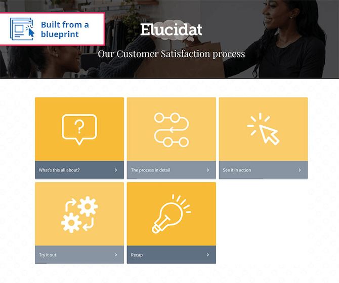
Image Source: https://www.elucidat.com/showcase/#in-depth-process-training
2. Pay Heed to Colors
Each color creates a unique effect and aesthetic appeal to your eLearning course. The human brain is capable of converting colors into moods and emotions. Colors, when chosen shrewdly, can turn boring content interesting and compelling, enabling learners to absorb and process the information quickly.
- Use contrasting colors to highlight important information. However, refrain from over contrasting.
- Don’t use clashing colors as they may create confusion in the minds of the viewers.
- Overuse of more colors will make the entire design look disorganized and chaotic. So, it is advisable to use just three or four colors throughout the course.
- Before deciding upon colors, learn about the background of the learners, such as their education, religion, age, etc., as these parameters have a direct impact on their interpretations and preferences.
Example: Coursera has used soothing colors to create an enticing visual experience for the learners. Take a look!

Image Source: https://www.coursera.org/
3. Consistency is the Key
If you want to build credibility and trust among your audience and create a cohesive experience, maintain consistency throughout the course.
- Create a color guide denoting which color to use for headings and sub-headings.
- Pre-designed eLearning templates aligned with your brand image are the best way to achieve consistency. You can make minor modifications to color, content, etc., while all other components will remain the same.
- Use the navigation icons with which the learners are familiar throughout the course.
- From the font to the writing, choose a single style guide.
Example: Udemy maintains a consistent design style throughout its course. Check it here!

Image Source: https://www.udemy.com/
4. Add Variety to Feast the Senses of Learners
Variety is the essence of life. As you love wearing new attire and munching a variety of food, similarly, learners love seeing a variety of visuals in the eLearning course. To help the audience connect better with your content and retain the shared information for longer, use the following visual aids:
- Videos
- Images
- Infographics
- Animated GIFs
- Graphs, diagrams and charts (flowcharts, line charts, pie charts)
- Illustrations and icons
- Screenshots
All these visuals will let you illustrate large chunks of complex information with less text and reduce language ambiguities. Moreover, these visuals will give your corporate audience and students a fresh and engaging way to learn new things and perspectives.
5. Pair Visuals with the Right Words
Making the course modules text-heavy will not serve your purpose well; rather, you will end up leaving the learners overburdened. However, by complementing the visuals with the power of content, you can make a difference, speed up the learning process, and keep the learners talking about it.
Check my advice on How can online presentations be optimized for different devices and screen sizes
6. Responsiveness Must Not be Overlooked
In this digital era, learners use different devices to access learning. Not all images perfectly fit all the screen sizes. An image that works wonders on a smart device may not render the same impact on smaller devices. So, keep designs responsive so that they can be used on as many devices as possible.
7. Familiarity and Connection for Forging Deep Learning
Visual stories that are more relatable to the audience keep them hooked. Include such visuals in your eLearning modules that evoke emotions, make the content interactive, and lead to enhanced retention of information. As your employees possess different core values and belong to different cultures, one thing to keep in mind while choosing visuals for corporate eLearning modules is that they are not offensive or shocking to anyone.
8. Be Innovative and Bring in Novelty
If you want to make your eLearning course stand out, make sure to bring creativity and innovation in designs. Take inspiration from what’s happening around you, and don’t hesitate to do experiments. The more you will bring modernity and freshness to the visuals and look, the more traction you will gain to your modules.
9. Keep Copyright Laws in Mind
The internet is flooded with zillions of images, but for using them in your course, you must have ethical and legal rights. Many websites offer royalty-free images, but some offer two types of usage rights – Creative Commons Licenses and Commercial & Other Licenses. Any infringement in copyright laws may lead to lawsuits, hefty fees, or both. So, before using any image, first learn the fair use clauses.
The Bottom Line
The use of impressive and self-explanatory visuals in eLearning modules makes your subject matter easy to comprehend, thereby reducing cognitive overload on the learners. In a nutshell, by combining your instructional strategy with the visual strategy, you can reshape your eLearning course and take it to the next level!
What’s your take on including visuals in your eLearning courses? Share your thoughts with us in the “Comment” section below. And if you like the blog post, do share it on your social media handles.


