Let’s assume a scenario where you are asked to prepare and deliver a presentation on a crucial topic related to your business. And, you go the extra mile to leave no stone unturned in preparing an information-rich PPT. You put forth the greatest possible effort in structuring and organizing the content and improving the aesthetics of the presentation. Despite a tough grind, you end up with a disastrous presentation! Down in the dumps?
If you don’t want this scenario to come true, ensure that you have not made your slides a dump yard of text for the sake of sharing a lot of information with the audience in a short amount of time. If you present with slides loaded with text, the audience will pay more attention to reading the content instead of focussing on what you’re saying. Moreover, it will make it difficult for viewers to understand the information.
So, here we have provided some tips to convert your text-heavy slides into visually impressive, meaningful slides. Read on!
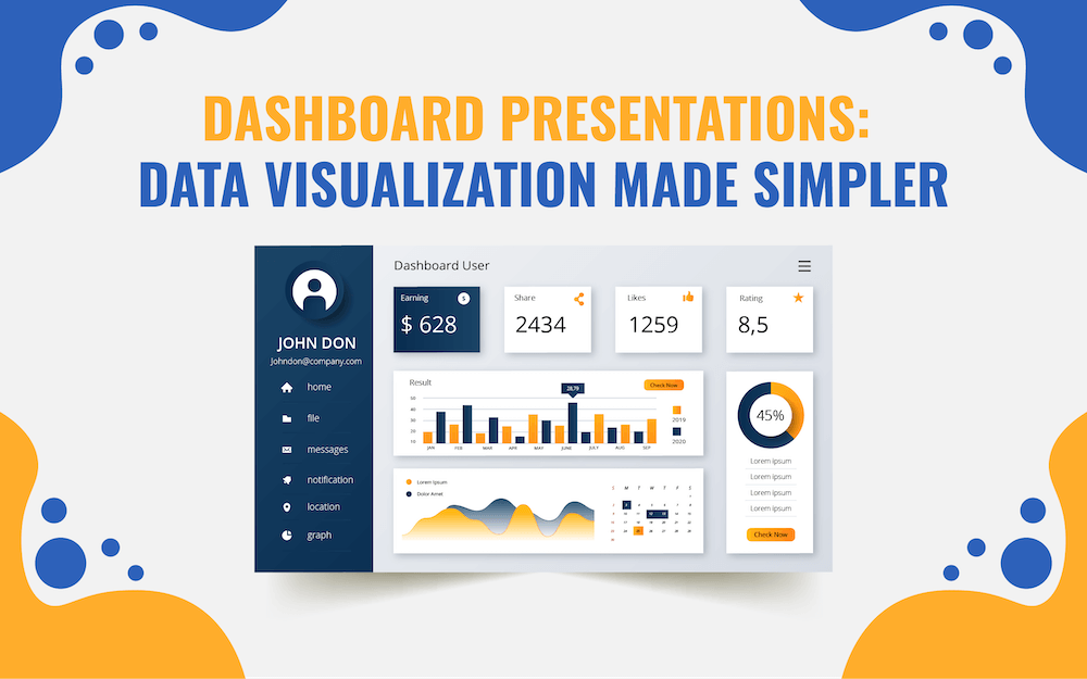
1. Convert Data Tables into Graphs or Charts
Illustrating the data related to market share, revenue generation from different regions/business units, business/market trends, comparison of data within one set or different sets, etc., through a table won’t make much impact. However, presenting the same information through diagrams & charts, and graphs will not only add a visual appeal but will also make it look organized and structured.
Useful Template: Diagrams & Charts
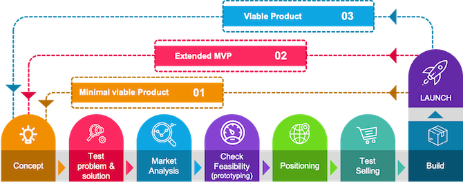
2. Showcase Processes through Diagrams
Instead of writing each step of a process in detail in your presentation, you can use diagrams to depict it beautifully and make it easy to understand for the audience.
- For showcasing linear processes, you can use process diagrams depicting each step in a separate box and direction of flow through arrows. You can write brief content in the boxes to explain each step.
- You can use cycle diagrams to illustrate cyclical processes.
- Multi-staged processes can be showcased through stage diagrams.
- The main process and its sub-processes can be better portrayed through tree diagrams.
Useful Template: Process Diagrams
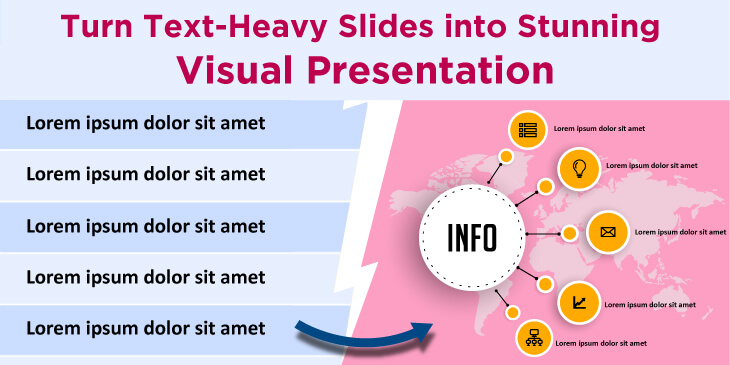
3. Display Mission, Vision, Achievements, and Other Key Information through Infographics
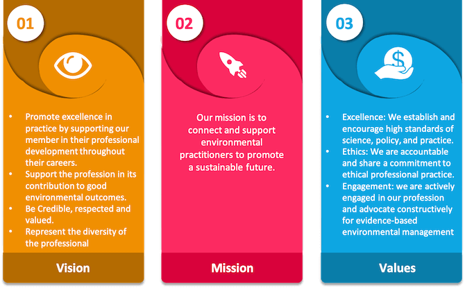
If you want the audience to retain crucial information for a longer time, represent it through infographics. It will help you build an emotional connection with them.
- For describing people of the team or management team of the organization, success journey, customer services and feedback, etc., you can use silhouettes and slideman infographics.
- Icons are the best way to demonstrate more information with less text.
4. Convert Long Paragraphs into Bullets
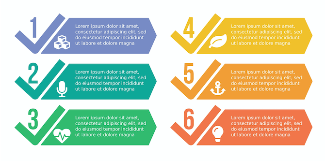
Break long paragraphs into small, readable, and understandable bullet points. You can use graphical bullets, such as arrow bullets and circle bullet points, instead of traditional ones for creating a long-lasting impression on the minds of the audience. Further, bullet points make it easy for the audience to scan and interpret the information quickly. As a rule of thumb, there should not be more than 6 bullet points on a slide and not more than 6 words in any bullet point.
5. Present Location-Specific Information through Maps
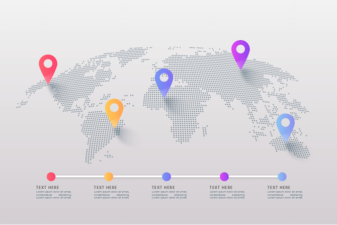
The location-specific business information, such as headquarters and branches of office in various regions of a country, areas with the highest customer base and market share, business expansion plans in new markets, revenue generation from different sales territories, etc., can be better explained through maps instead of plain text.
6. Represent Relationships Using Different Shapes
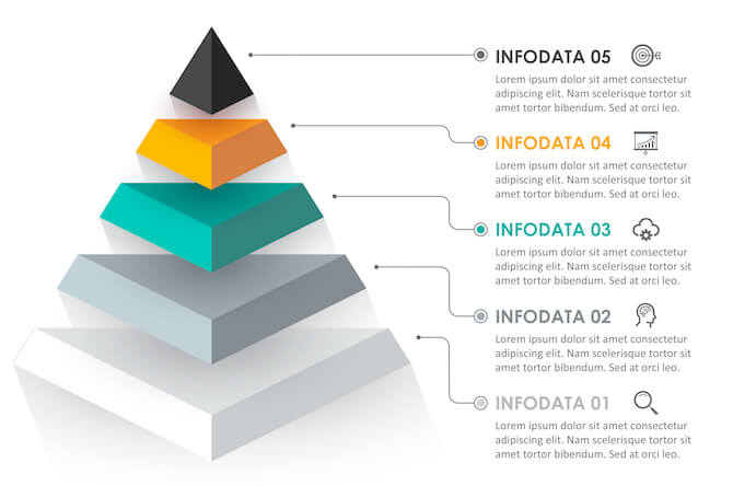
Consider using different shapes to depict relationships between various data, stages, and processes. For instance, use Venn diagrams to illustrate overlapping relationships, arrows to represent sequential relationships, flowcharts to portray logical relationships, pyramids to demonstrate hierarchical relationships, etc.
Useful Template: Shapes
7. Demonstrate Strategies and Tasks with Striking Visuals
The information about the history of an event or company, goals to be achieved, tasks and milestones of a project with their deadlines, etc., can be depicted with the minimal text through timelines.
Furthermore, the strategies to accomplish the set goals, hurdles and challenges in achieving a milestone, and other such information can be represented using roadmaps.
8. Move Text into the Speaker Notes
Sometimes, speakers add content for their own cues (which are actually not meant to be read by the audience), thus making the slides packed with text. This is not a good practice.
You can remove all the unnecessary data and information from the slides and put them in the Speaker Notes section at the bottom of each PowerPoint slide. It will let you not miss any important point while delivering the presentation. At the same time, it will help the audience focus on the relevant information on the slide.
9. Remove the Text that is Not Relevant to the Core Message
To make your slides crisp and concise, remove all the information that doesn’t add value to the core message. Include only those points that support the goal of your presentation and are absolutely required to make your audience understand the concept.
Hope you find this blog post helpful. We would like to know more tips from you. So, share your thoughts with us in the “Comment” section and share the post on Facebook and Twitter.

