


Similar Products
- Sale

- Sale
- Sale


Struggle no more with chart creation. Simply use our pre-designed PowerPoint Pareto Charts Template and be effective like never before! Charts and diagrams occupy essential part in regular business presentations but they aren’t that easy to be made. It can take hours of efforts to finally be ready with them. With tight time-constrains and so much more to do, it appears a really burdensome job. Thus, ready-to-use substitutes prove handier. You’ll not just save your time and efforts but will be amazing at visualizing your ideas!
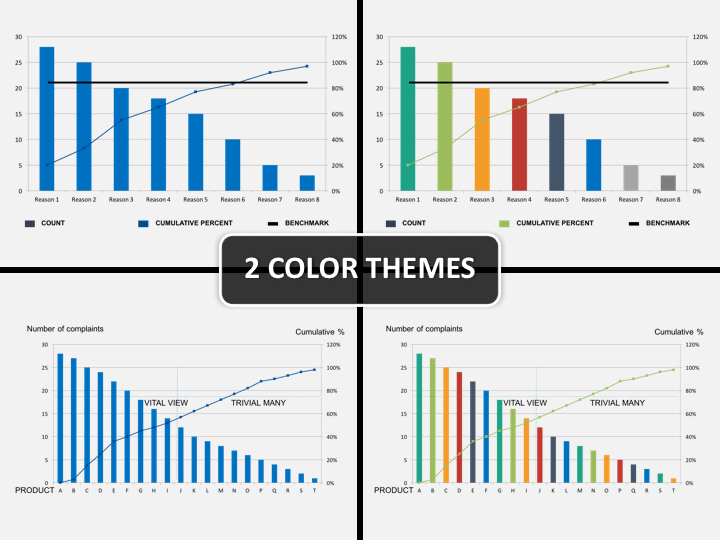
These data-driven charts prove best in representing any kind of cause and effect factors and add new charm to your presentation. Not only it gets easier to explain your point, there is absolutely no confusion in analyzing and evaluating various different kinds of issues and the way they are creating afflictions of different kinds. Best for problem solving sessions and issue & solution related brain storming team-meet up. The set offers various different kinds of charts giving you total freedom and versatility in communicating your point. Regardless of your business and industry type, you can depend on the set for your presentation needs. Whenever you have to evaluate all kinds of problems and in ranking them as per their frequency, you can use the slides on the set!
About
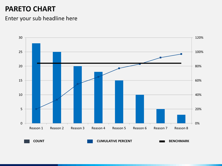
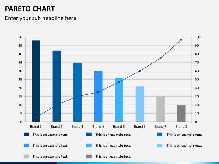
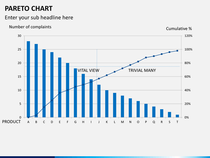
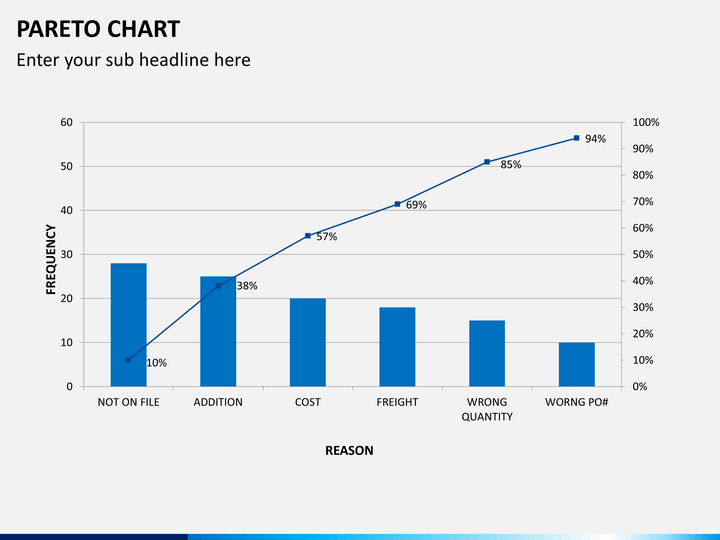
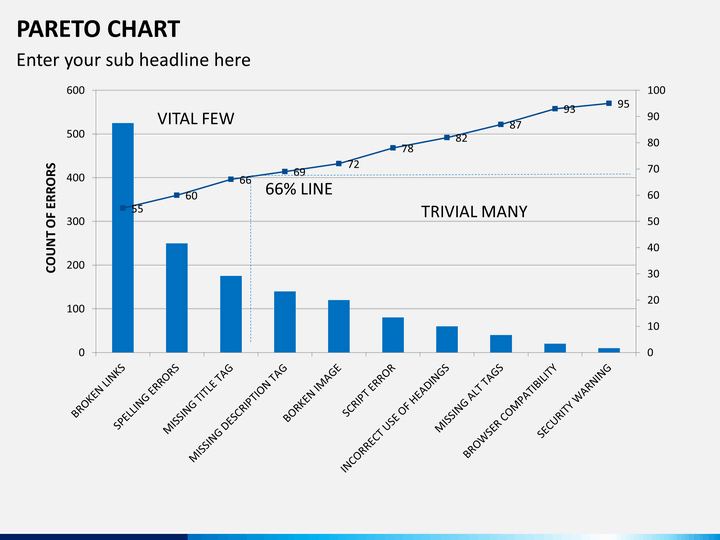
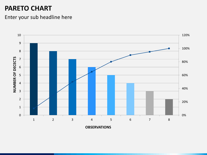
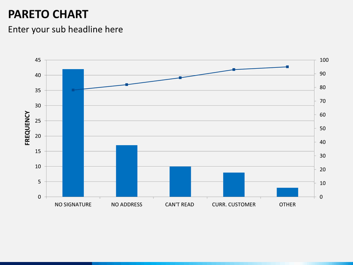
Pareto Charts, also known as Pareto Distribution Diagrams, are a kind of vertical bar graphs that are used to present values plotted in decreasing order of relative frequency placed from left to right. They are best known for problem analysis when there are several smaller issues leading to a complication and it is difficult to focus on one particular problem. With the help of the chart, one can rank all the issues on the basis of their frequencies and illustrate which of the issues (or variable) have greater cumulative effect compared to the other in the system. It is best for fault finding as it gives a more pragmatic proof of the faults that work in much better way than intuitive imagining.
Write Your Own Review

Related Products


