
Presentations are no longer regular sessions where you simply sit and listen. Over the years, they have evolved into experiences that resonate with the audience and evoke specific emotions. They are immersive and require the perfect visual and auditory experience that people can relate to and retain. One of the most underrated tools to ensure the perfect experience is the presentation’s color palette, as the right colors can instantly elevate a basic deck into a brilliant one.
Think about it – before your audience even hears you, they look at the slides. They see the colors, feel like emotion behind them, and set expectations about what will follow. Whether you are pitching an idea, teaching a concept, or presenting business results, your choice of colors can either strengthen your message or distract from it. In this article, we will understand the nuances of a color palette and see examples of failproof palettes.
What Is a Color Palette and Why Do You Need One?
When you build a home, how do you decide the shades of your rooms? Well, there is a theme that follows through the house- whether it’s muted browns, cream, and ivory, or regular shades with highlighted walls. This is the color palette- a set of colors that determines the shades for the entire house, or here, the presentation.
Instead of randomly picking colors and selecting diverse hues, a color palette allows you to bring coherence and consistency throughout the deck. It makes your slides look much more professional and visually appealing. Besides, there are multiple other reasons that make picking the right color palette extremely crucial. Let us understand them one by one.
1. Makes Your Presentation Cohesive
A neat and color-consistent deck anchors audience attention and enhances engagement. Imagine attending a presentation where the first slide has orange and cream colors, and the next has blue, the one after has green, and so on. How uninterested and distracted would you be! Thus, using a dedicated color palette makes your presentation more cohesive and improves visual identity.
2. Evokes Certain Emotions
Colors are meant to evoke certain emotions, and this concept is called color psychology. Most presentations have a certain outcome- whether it is to inspire, educate, inform, or drive action. Each objective can be achieved by using specific colors that ignite and foster particular feelings and enhance relatability.
For example, blue often conveys trust and calmness and is highly used in professional decks, high-stakes meetings, executive briefings, etc. You will see that most formal presentations and company logos include blue.
Further, colors also help define the tone of the presentation. If you use muted beige and browns, it may seem like a semi-formal deck. Colors such as yellow and orange reflect informal settings and fun-oriented slides, whereas green, black, and white showcase more formal environments.
3. Supports Your Message
Consider that you need to talk about saving the environment and conserving water. If you use random reds and browns, nobody would relate to you. However, if you use blues and greens that reflect the environment, the colors would support your message completely.
Therefore, using the right colors adds more credibility and trust to your message. They enhance your core points and help fulfil the objective or outcome.
4. Enhances Aesthetics & Attention
We live in a world of short attention spans, and anchoring the audience to your slides is a challenge. This is where color palettes come in- they instead make your deck look visually appealing, engaging, and entertaining. This enhances the aesthetics and attention of the viewers, keeping them focused for much longer.
5. Reinforces Brand Recognition
Think of a cold drink brand with red. Did you think of Coca-Cola? Of course, you did! Such is the power of branding and colors. Your brand colors speak much before your slides do. Hence, it is crucial to pick colors that reflect your vision, values, and work, and curate decks around them. This will not only strengthen brand recognition but also enforce an emotional connection with the audience.
6. Reduces Clutter
Using a consistent and defined color palette reduces any unnecessary colors or themes that may clutter the slides. When you use too many shades at once, you make the slides look unprofessional and overwhelming. Therefore, a clear, concise palette can make the task easier and help your deck stand out.
How to Select the Perfect Color Palette?
(i). Understand Basic Color Theory
Before you select shades, it is crucial to understand basic color theory principles. These are the rules on which colors work best together, which ones reflect certain emotions, the color wheel and its primary colors, and more. This knowledge is important as it helps avoid clashing multiple irrelevant colors and allows you to pick the best possible hues for your deck.
For example, complementary colors (like blue and orange) create contrast and energy, while analogous colors (like blue, teal, and green) create harmony and calmness. Understanding these relationships allows you to intentionally design the mood of your presentation instead of guessing.
(ii). Know Your Purpose
Being clear about the goal of your presentation is crucial for success. Before selecting colors, evaluate the objective of your deck- whether it is to inspire, acknowledge, educate, or persuade. This is because your purpose directly impacts your selection and choice of colors.
For example, a business pitch meant to inform might be curated with blues and teals, while a science lesson for educational purposes can be in multiple shades of yellow, red, and green, to attract the students.
(iii). Choose a Base (Primary) Color
Now, let us understand how you can actually build your color palette from scratch. Start by picking a base color, also known as the primary color. This will appear the most in your deck- on backgrounds, headers, and key design elements, and occupies the most amount of space on the slide. Thus, this sets the tone for your presentation.
Remember that this color should reflect your message or brand identity. For example, if you are presenting for a brand, use its main brand color. If not, choose a color that matches the mood you want to create—calm, energetic, luxurious, or minimal.
(iv). Add Supporting (Secondary) Colors
Secondary colors support primary colors without overshadowing or overpowering them. They allow the primary colors to breathe, and focus on headings, sub-headings, titles, charts, graphs, etc. These colors should always work well with the base color; they should complement and elevate the look. Secondary colors usually add contrast in a subtle yet magnificent way.
For instance, if your primary color is cream, your secondary colors can be beige and brown. These will add contrast yet not overwhelm the audience.
(v). Pick an Accent Color
An accent color is used to highlight important elements like key points, buttons, call-to-action text, or data highlights. It is usually brighter or more contrasting than your other colors, making it stand out immediately.
The purpose of an accent color is to anchor the audience’s attention. When used correctly, it guides the audience’s eyes to the most important parts of your slides without overwhelming them. However, it is important not to overuse your accent color. If everything is highlighted, nothing stands out. Thus, it is crucial to use it strategically and tactfully.
(vi). Ensure Your Colors Are Readable
You might choose the best colors and combinations, but if they are not readable, your presentation will make no sense. Therefore, always ensure readability and accessibility of your color palette- they should be readable from afar as well as by people with certain visual needs.
When your colors are well readable, not only do they retain attention, but also reflect your thoughtfulness and seriousness towards the audience’s needs and comfort.
The best way to ensure this is by running a mock trial on multiple devices and screens. Check for the fonts and colors from the back, read the texts, headings, illustrations, etc., and fix anything that is not clear.
(vii). Keep the Colors Less
Using too many colors can make your deck seem chaotic and cluttered. Instead, focus on only three to four colors for your slides. Further, ensure that your primary color is neutral and can provide ample negative space for the content. This will add a subtle shade yet make your slide look neat and tidy.
(viii). Make it Minimal
Minimalism is the way to win your audience’s hearts. In color theory, it refers to using lesser shades and removing loud colors. When you use colors that are subtle and minimal, such as beige, cream, and pastels, your deck automatically seems more professional and trustworthy.
Best PowerPoint Color Palettes You Should Use (With Examples)
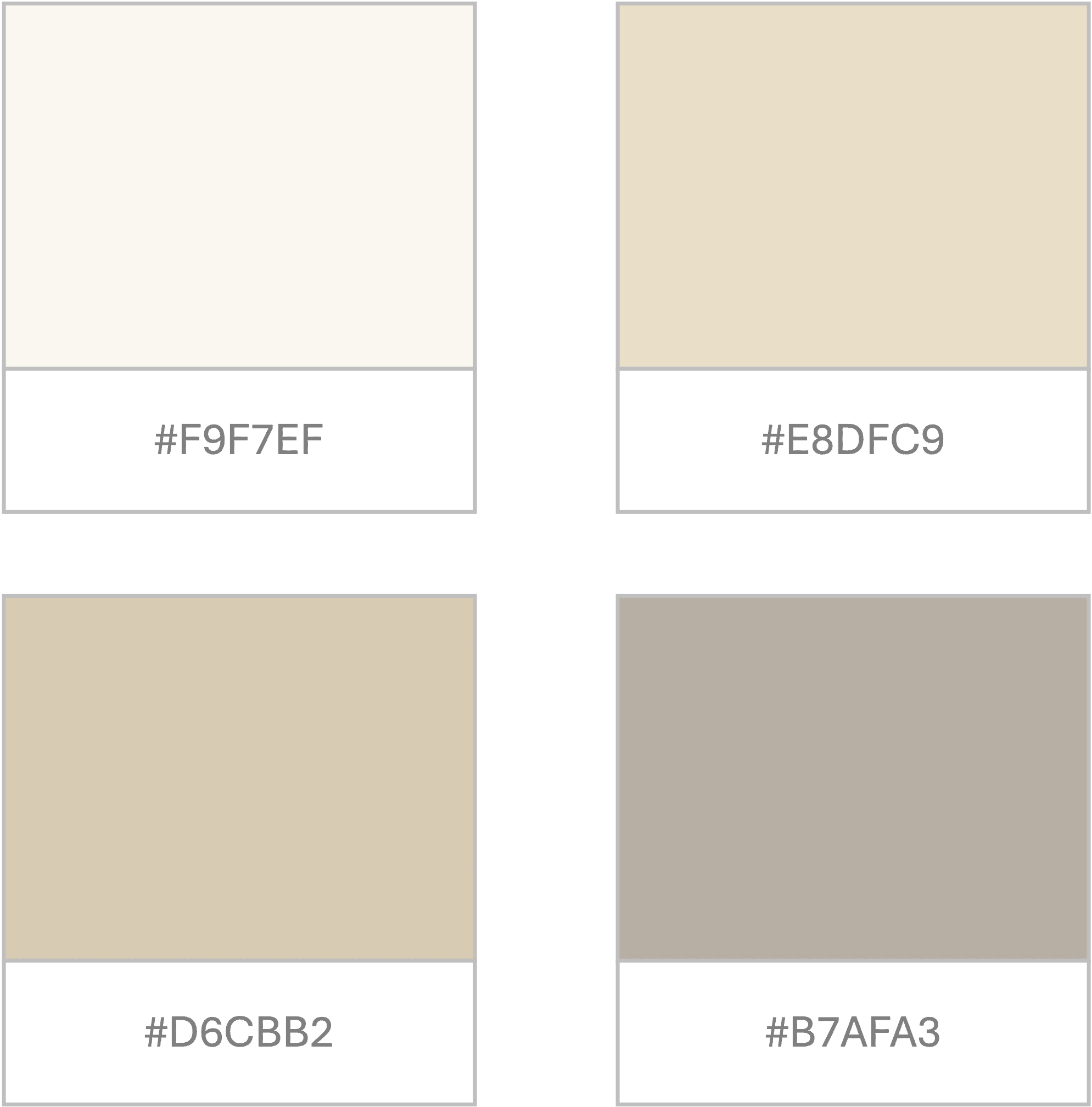
1. Minimal and Beige Shades
If you want your presentation to look extremely neat, clean, and tidy, use a minimal and beige color palette. These shades reflect confidence, credibility, and expertise. They instantly elevate the look and are highly used in luxury, lifestyle, and creative portfolio presentations.
The core reason for this palette to work is its warmth- the beige and brown tones reflect sophistication and feel quite inviting. They instantly calm your senses and create a composed environment.
To use this, you can layer different neutral tones to add depth without adding clutter. You can also use slightly darker shades for headings and lighter tones for backgrounds to create a refined hierarchy while keeping everything cohesive.
Suggested Hex Codes:
- #F9F7EF (Soft Cream)
- #E8DFC9 (Light Beige)
- #D6CBB2 (Warm Sand)
- #B7AFA3 (Taupe Grey)
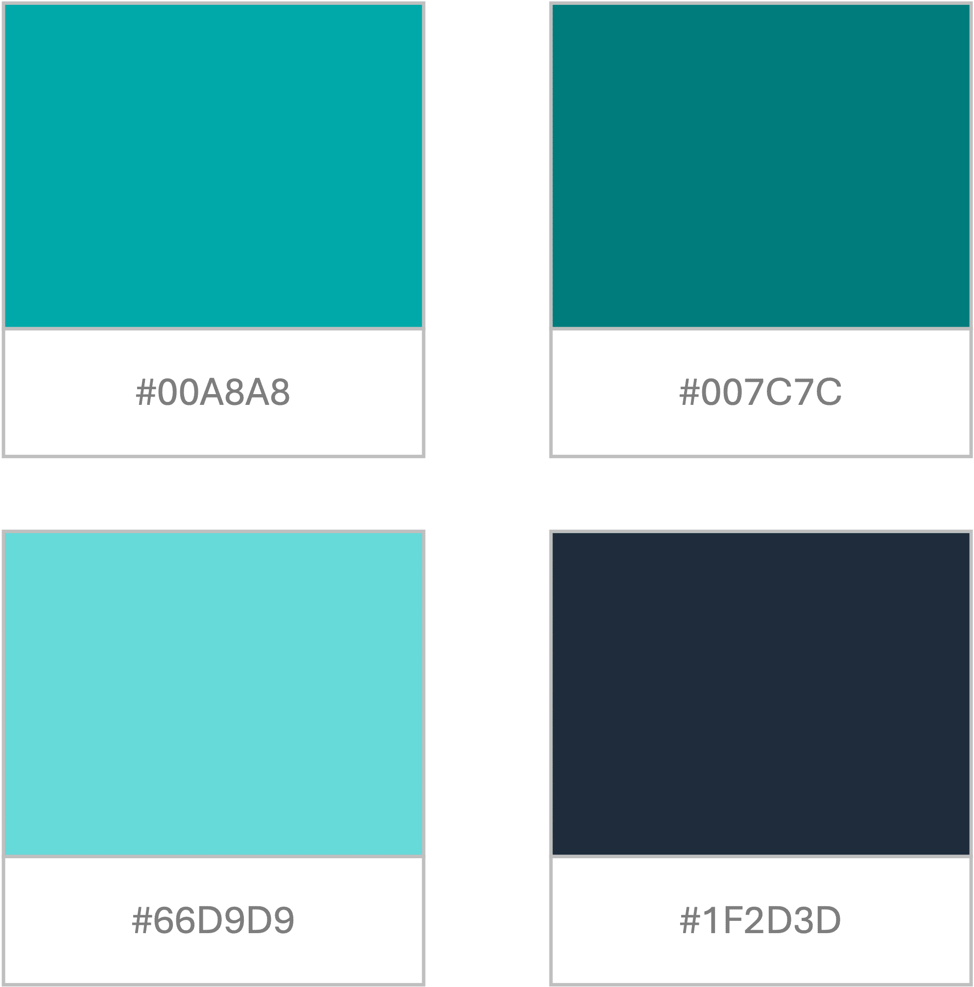
2. Energetic Teals
If your presentations require energy, enthusiasm, and fresh perspectives, energetic teals are the best pick for you. Teal-based colors are the perfect shades between blue and green, and showcase professionalism and good energy simultaneously.
You can experiment by adding shades of navy blue and charcoal to ground your design and make your deck seem more credible. These shades are best for tech firms, IT industries, and even startups that are driven on energy and momentum.
Suggested Hex Codes:
- #00A8A8 (Primary Teal)
- #007C7C (Deep Teal)
- #66D9D9 (Light Aqua)
- #1F2D3D (Dark contrast tone)
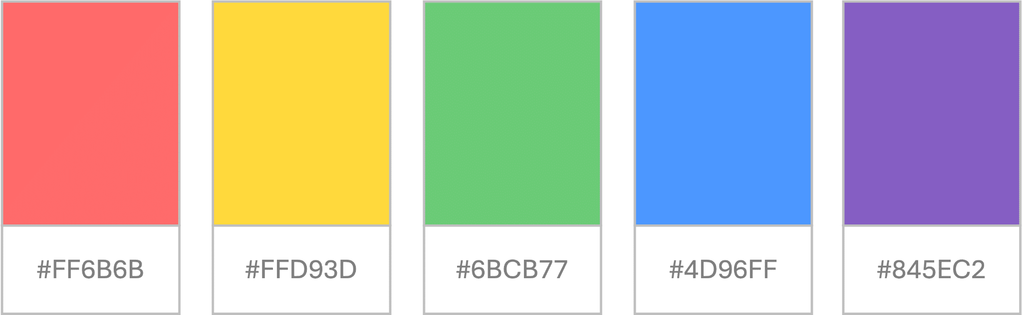
3. Vibrant and Colorful
Not all presentations require subtle and professional shades. Some need vibrant and lively colors that attract the audience and anchor their attention. This is where this palette comes in- vibrant colors are usually used in semi to informal settings such as educational presentations, trainings, youth-centric decks, etc. These are high-energy and contrasting colors such as red, yellow, purple, coral, etc.
Suggested Hex Codes:
- #FF6B6B (Coral Red)
- #FFD93D (Bright Yellow)
- #6BCB77 (Fresh Green)
- #4D96FF (Vibrant Blue)
- #845EC2 (Purple Accent)
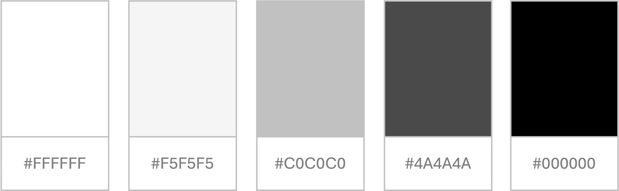
4. Subtle Monochromes
Monochromes can never get old and are the best shades to use when nothing else feels right. These are the safest and easiest colors to adjust with any design, theme, topic, or audience. Monochrome palettes usually include black, white, and grey, and a couple of their variation shades.
The key strength of monochrome is that it eliminates noise and unnecessary clutter from the deck, keeping the focus only on the content. It also ensures high contrast, allowing for readability to become clearer and better than other color combinations.
Suggested Hex Codes:
- #FFFFFF (White)
- #F5F5F5 (Light Grey)
- #C0C0C0 (Mid Grey)
- #4A4A4A (Dark Grey)
- #000000 (Black)
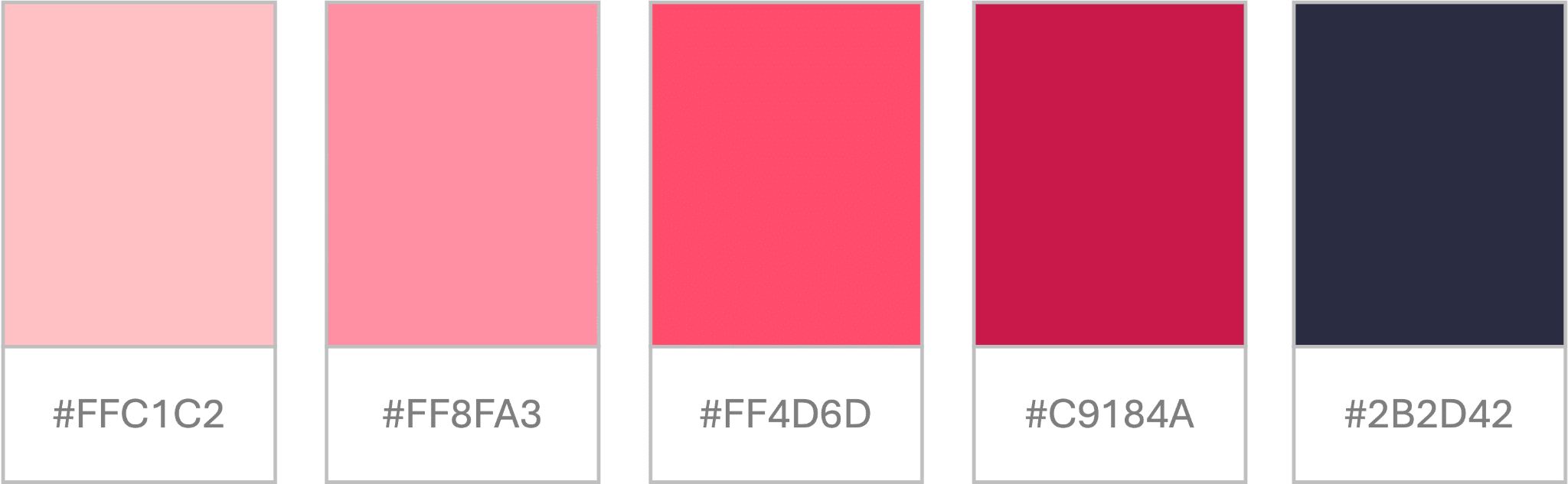
5. Confident in Pinks
Pink palettes are no longer associated only with feminine designs; they are now being used rightly across all platforms for bold and subtle decks, both. When used correctly, shades of pink can be bold, unique, and fresh at the same time. They can add a sense of personality to the presentation and are highly used in fashion, storytelling, product design, packaging, etc.
Instead of using a regular pink color, you can choose from multiple variations such as rose gold, blush pink, dusty pink, contrasting deeper tones, etc.
Suggested Hex Codes:
- #FFC1C2 (Soft Blush)
- #FF8FA3 (Dusty Pink)
- #FF4D6D (Bold Pink)
- #C9184A (Deep Rose)
- #2B2D42 (Dark Contrast)
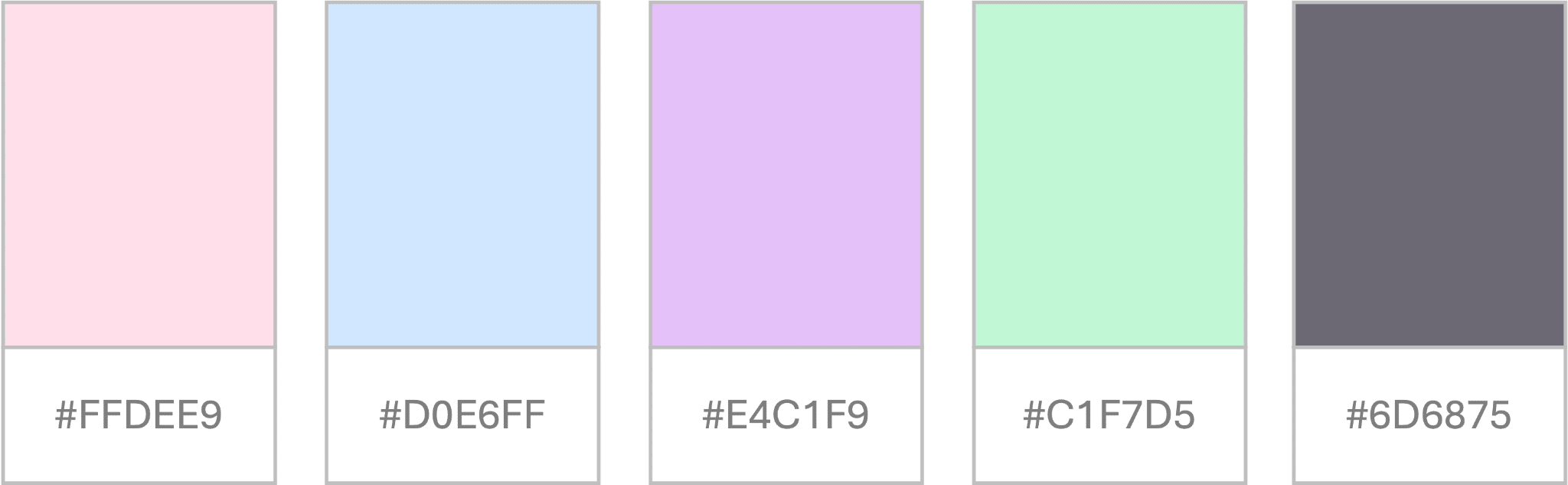
6. Calming Pastel Theme
Pastel palettes are extremely soothing and always elevate the audience’s moods. They are perfect for presentations that need to be gentle, subtle, and approachable, making them ideal for anything related to children, wellness, and even lifestyle.
Over the years, there has been a massive shift from primary colors to pastel shades, and the internet is an example. From packaging to product development, pastel shades have been dominating the market all over, and the same goes for presentation design.
When paired correctly, these shades can be extremely impactful and effective for all designs and industries.
Suggested Hex Codes:
- #FFDEE9 (Light Pink)
- #D0E6FF (Baby Blue)
- #E4C1F9 (Lavender)
- #C1F7D5 (Mint Green)
- #6D6875 (Soft dark text)
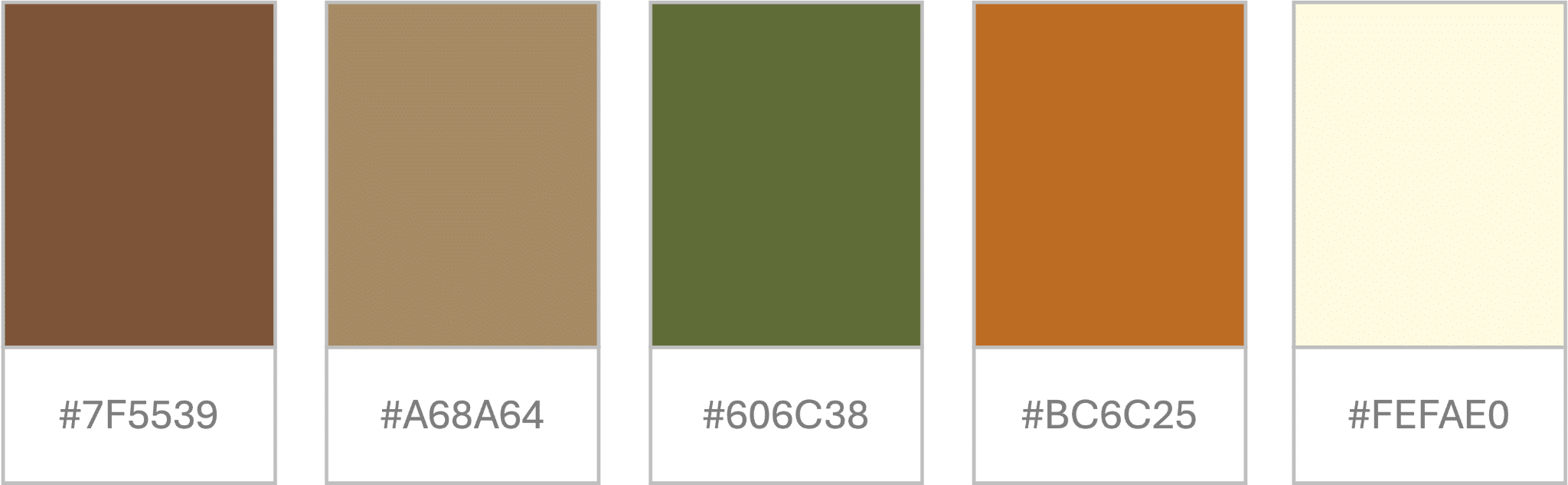
7. Earthy Tones
If you want your presentation to be grounded, earthy, and organic, you must use an earthy palette. They are ideal for sustainability, wellness, and eco-friendly presentations, as they reflect natural colors.
Suggested Hex Codes:
- #7F5539 (earth brown)
- #A68A64 (sand)
- #606C38 (olive green)
- #BC6C25 (terracotta)
- #FEFAE0 (light cream)
Common Mistakes to Avoid While Picking a Color Palette
a). Test Before Finalizing
Testing your presentation before the big day is a necessary practice, and it becomes even more important when you are experimenting with colors. Your shade card might look appealing on a laptop or iPad, but the real test is when it is displayed on a bigger picture screen to the audience. Do the colors look overly bright, dull, or are they the same? Are the icons and illustrations clearly visible, or do they camouflage with the background? Are the headings and texts easy to read and comprehend, or does the audience need to squint their eyes?
When you answer such questions, you will find solutions to any problem with colors and can fix them before the final presentation.
b). Do Not Cram Colors
Your color palette usually includes four to five colors, but this does not mean that you cram all shades onto one slide or make the deck overly colorful. Remember, in a color palette, there is a purpose for each shade- some are primary colors, some secondary, and others are accent shades. Be mindful when you pick colors for various purposes and ensure consistency across all slides.
c). Distinguish Charts and Graphics
Charts and graphs need to distinguish colors to make them stand apart. These cannot be the same as your heading colors or illustrations. Mostly, charts are curated with shades of the same color, such as blue. The highest frequency is represented with the darkest shade, and the lowest with a lighter shade. This leads to a strong visual coherence and allows clear data visualisation and a bird’s eye view of the entire graph.
Conclusion
Picking the right color palette can seem quite challenging, especially if you have no design background. While you can choose ready-to-use templates and shade cards, or take AI’s help to craft your own color card. But first, know your basics- understand the purpose, type of presentation, audience, etc., and then curate a palette that truly stands out. We hope this article and these examples help you craft a perfect color palette for your next presentation!


