
We have colors all around us, and each color affects our subconscious differently. The green trees calm us down, while the multi-colored flowers evoke a sense of freshness and rejuvenation. There is a certain emotion you feel when you see the pitch dark sky at night and the booming colors of spring take you somewhere else.
We may be conscious of it or not, but colors affect us on a subliminal level and can make us feel drawn toward an idea or reject it.
Knowing this, it becomes imperative to learn about color theory when creating any visual content.
This article details everything you need about color theory to help you create impactful PowerPoint presentations.
What is Color Theory?
Color theory, in total, explains the art and science behind colors. It explains the visual effect colors create in relation to each other, how we perceive colors, what message each color denotes, etc. It is a guide to help us determine what colors go well together and the kind of response they evoke in viewers.
The Basics of Color Theory
Just like people are judged by their outward appearance, so is your content based on the visual elements incorporated in the design. Let’s find out what each color says to your audience and how they are perceived.
The color wheel demonstrates the relation among different colors. So, we have primary (red, blue, yellow), secondary (violet, orange, green), and tertiary (red-orange, red-violet, blue-violet, blue-green, yellow-green, and yellow-orange) colors. The color wheel comprises all these colors.
Let’s learn about tints, shades, and tones.
- When you mix a color with white, you get tints (lighter than the pure color).
- When you mix a color with gray, you get tones (duller than the pure color).
- When you mix a color with black, you get shades (darker than the pure color).
You have warm colors like red, orange, and yellow, which demonstrate energy and fervor, and cool colors like green, blue, and violet, which exhibit reliability and professionalism.
Color Combinations You Can Use for Your Slides
Craft your next presentation slides according to the color theory to create a visually coherent and impactful presentation.
1. Complementary Colors

These are the colors on the opposite side of the color wheel, like red and blue. Complementary colors are a good combination as they highlight and intensify each other.
2. Triadic Colors
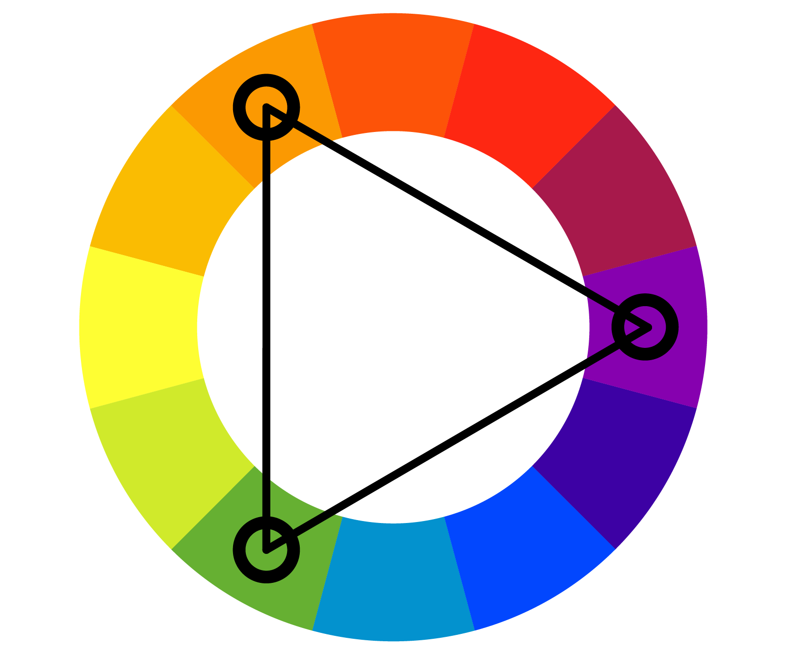
Triadic colors are three colors that are equally apart from each other on the color wheel. Blue, green, and red are one of the most common combinations. These colors help create more contrast and are ideal for a sales pitch (color combination exhibits professionalism and cheeriness).
3. Analogous Colors
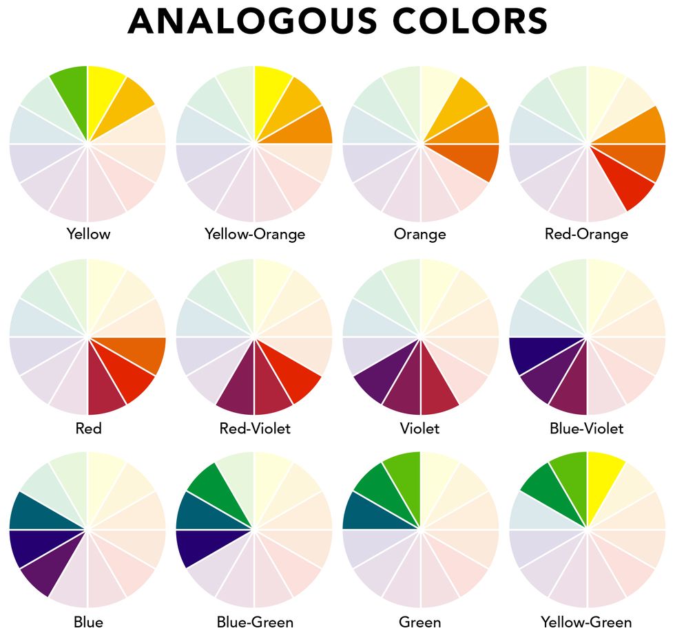
These colors are three colors that are side by side on the color wheel. The color combination is pleasing to the eye and blends perfectly with each other. Blue, green, and yellow are one of the most common combinations. The colors denote professionalism and bring a sense of freshness to the slides, making them ideal for informative presentations.
4. Tetradic Colors
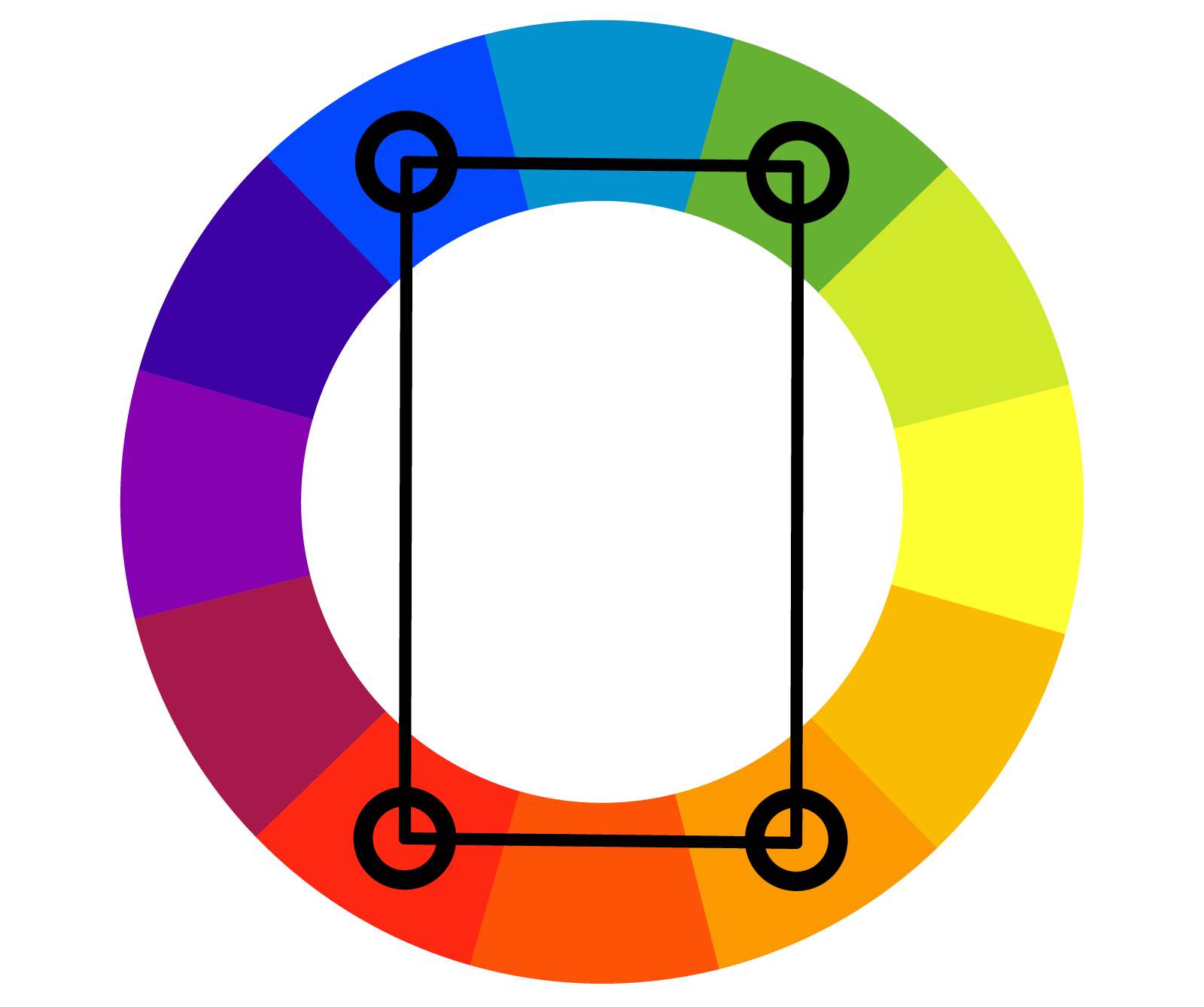
These are four colors equally apart from each other on the color wheel. You can use shades of red, blue, yellow, and green as a color combination, making your presentation vibrant and colorful. This combination is ideal for visual data, like charts, bars, graphs, etc., and good for quarterly reports.
Note – Use one color as dominant and the others as accent colors.
5. Monochromatic Colors
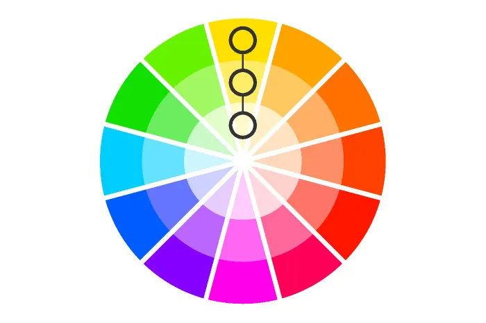
You get 3 shades of the same color by mixing it with other colors.
If you wish to create consistency in your slides, monochromatic colors are your best bet. Viewers are able to focus easily since it’s different shades of a single color. A monochromatic blue is a good option for presentations as the color instills a sense of trust, calmness, communication, and professionalism.
How to Figure Out the Ideal Color Pattern/Scheme?
Let’s find some handy tricks and tips that will help you choose the ideal color schemes for your presentation slides.
a). Go for Contrast
Creating slides with contrast will help you highlight important parts of the presentation slide and get maximum engagement. If you have a darker background, you will obviously have to go for lighter fonts. Similarly, if you go for monochromatic colors, it is wise to highlight important parts by using complementary colors.
Pro Tip – Go for shades, tones, and tints to create a catchy slide. You can select the color palette by going for shade/tint/tone of one color and a pure hue, three spaces away on the wheel as your accent color.
b). Don’t Go Overboard
Simplistic and minimalistic designs are gaining a lot of traction now and for the right reasons. Keep your color scheme restricted to 3-4 colors to keep your slides catchy and appropriate.
c). The 60/30/10 Rule
You can keep the 60-30-10 rule in mind when using colors. The rule states that you use the dominant color for 60% of your slides, the secondary color for 30%, and accent colors for the remaining 10%. Choose the primary color according to the emotion you wish to evoke in your audience; for instance, warm colors denote energy and enthusiasm and might be a good option when you want to get your audience to act.
d). Build a Structure Using Colors
Just the way we can use negative space and shapes to provide structure to the presentation, you can use colors as well. Break the content into smaller chunks and use colors that help your text stand out.
You can also provide structure to your presentation by coloring your headings and subheadings similar on each slide. This way, the audience will automatically find the information with a single glance on each slide. You can use colors to smoothen the flow of your presentation and take the viewers’ attention to the parts you want.
In a Nutshell
Our world is primarily visual now. Visual cues are central in creating powerful first impressions and likeability and recognition of a brand. Colors are an integral part of any design, along with images and typography. Knowing the color theory will help you learn all about colors and choose the best combination for your slides. Keep the tips in mind for your upcoming slides and create an impactful presentation.
You can also use pre-designed and editable PowerPoint templates with gorgeous color schemes in your presentations to make a big impact. These decks allow you to customize the slides according to your brand colors to gain traction.


