PowerPoint is an excellent tool for communication used by presenters across numerous industries. And, though images are a great way to make your PowerPoint presentations memorable, at the end of the day it’s the written text that is the glue holding your message together.
This makes the typography the most important visual element in your entire presentation. How you present your type… the fonts, colors and point sizes… can make or break your entire presentation.
With this in mind, here are 7 ways you can create better typography for your PowerPoint presentation. These tips will ensure a more polished and professional-looking piece.
Go Big or Go Home
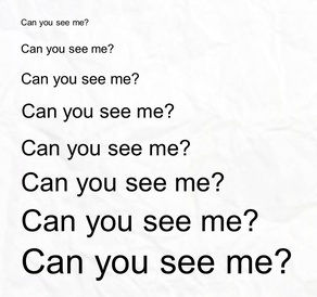
There are a few things you don’t want your audience to do during your presentation: talk, sleep, and squint. There will be certain slides that your audience will need to carefully read, so make it easy for them. Never use a point size smaller than 12, and ideally, use fonts in the 16-18 range. When your audience doesn’t have to struggle to read your text, they can pay better attention and absorb your entire message.
Make Your Headlines Bold
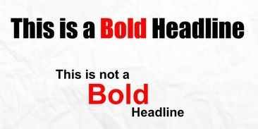
Headlines are meant to really grab attention, and they can hardly do that when they blend in with the text around them. While your body copy should be 16-18 point (14 if you are really having space issues) your headlines should be 20-24 point.
Let Your Text Breathe
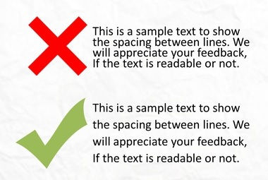
Whether it’s in a PowerPoint slide or a newspaper article, no reader enjoys seeing big, chunky blocks of text. It causes the same anxious, exhausted feeling people get when they see a big hill they have to climb. It’s important to let your text “breathe” by adjusting the space between lines. Generally, a line spacing of 1.1 – 1.5 will open up your text and make it more inviting to read.
Do NOT Get All Fancy with Your Fonts
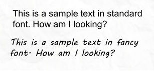
Many people like to get creative with their PowerPoint presentations, and often this can be a good thing. But it can also end up biting you in the you-know-what, especially if you get all fancy with your font selections. It’s best to stick with standard Serif font faces such as Arial, Verdana, and Trebuchet. The trouble with straying from these standard fonts is, should you move your presentation between computers, you could run into problems when a particular device does not have the font installed. Play it safe and go standard.
Now you may be wondering why I have not included standard Serif fonts like Times New Roman and Georgia. That is because there is now a common school of thought that, while those fonts look great in print, they are a bit harder to read on digital screens because of their more decorative nature.
Pick Contrasting Font Colors
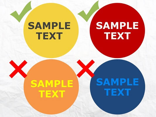
It’s important to select font colors that contrast with the background. If your slides have a white background, black and dark versions of blue and red work really well. For dark background, plain ol’ white is your best option, though pale blues and yellow can also work quite well.
AVOID AT ALL COSTS: Any black and red combination or similar color combinations such as an orange background with yellow text, or a dark blue background with light blue text.
Don’t Use the Same Old Boring Bullet Point
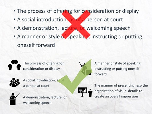
Admittedly, bullet points are a great way to present important bits of information during your PowerPoint presentation, no argument there. But here is an opportunity where you can get a bit creative and gain some audience interest.
- Make the bullet point a different color than the text. This is a great way to draw your audience members’ eyes to important text.
- You could also make each bullet line a different color. This works particularly well when your bullets are spaced strategically throughout your slides.
- Also, PowerPoint allows for a variety of pre-installed symbols and even imported graphics, so consider using different shapes for your bullets!
Be Consistent
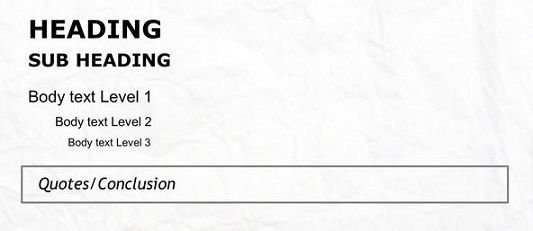
The most important rule in design, no matter the medium, is consistency. Whichever way you choose to design your master template, STICK WITH IT for the entire presentation. If you decide to go with 22-point Verdana for the headline font, 18-point Arial as the body font, and colorful bullet points, use that combination throughout your entire presentation. This goes for positioning of text as well, not just size and color. Nothing screams amateur PowerPoint designer more than text fields that jump around from slide to slide.
No one said giving a presentation was easy, and I’ve clearly just illustrated there’s even more work involved than you may have originally thought. The good news is, by putting some extra thought into your PowerPoint slides and following these typography tips, you will taste success every time.


Good tips for presentation. Thank you.
Great article, with many good points to keep in mind.
I definitely disagree about using fancy fonts.
Great basics to review every now and then! Thank you!
Good. I believe this will breath more life into presentations and go a long way in expanding audience attention span.
Thanks a lot.