Presentation Design Trends 2026: The Ultimate Guide to Future-Ready Slides

Presentation design in 2026 is no longer about decorating slides – it’s about communicating ideas with clarity across multiple contexts. Slides are presented live, shared asynchronously, viewed on laptops, and skimmed on mobile screens. As a result, presentation design has become more strategic, more intentional, and more audience-aware than ever before.
What truly differentiates 2026 is the convergence of AI-assisted creation, accessibility-first thinking, hybrid audiences, and brand-led design systems. Presentations are now expected to perform well without the presenter, adapt to different viewing environments, and still feel human.
This guide explores the most important presentation design trends of 2026, explains why they matter, and shows how to apply them without sacrificing clarity or impact.
Why Presentation Design Trends Matter More Than Ever in 2026
Presentation design trends matter in 2026 because audiences consume slides across live, remote, and mobile environments, making clarity, accessibility, and visual hierarchy essential for effective communication.
Key reasons trends matter now:
- Attention spans are shorter and distractions are constant
- Presentations are frequently shared, reused, and viewed without narration
- Decision-makers rely on slides to summarize complex ideas quickly
- Poorly designed slides reduce trust, comprehension, and engagement
In 2026, how a presentation looks directly affects how its message is understood and remembered.
Core Principles Shaping Presentation Design in 2026
Before exploring individual trends, it’s important to understand the foundational principles driving them:
- Clarity over decoration – Every design choice must support understanding
- Story over slide count – Structure matters more than volume
- Consistency over improvisation – Repetition builds familiarity
- Accessibility by default – Design must work for everyone
These principles ensure that trends enhance communication rather than distract from it.
Top Presentation Design Trends Defining 2026
1. AI-Assisted Presentation Design (Human Creativity + Machine Speed)
AI-assisted presentation design uses artificial intelligence to generate outlines, layouts, and formatting while humans control strategy, storytelling, and final decisions.
AI has become a standard part of the presentation workflow. It accelerates repetitive tasks and reduces formatting effort, allowing presenters to focus on message and narrative.
AI is commonly used to:
- Generate slide structures from prompts
- Suggest layouts based on content type
- Auto-format spacing, alignment, and hierarchy
- Create draft charts, visuals, and icons
However, AI still lacks:
- Contextual audience understanding
- Persuasive storytelling instincts
- Brand nuance and originality
The most effective teams use AI as a starting point, not a final solution.
2. Ultra-Minimal Slides with Maximum Impact
Ultra-minimal presentation design emphasizes one idea per slide, generous white space, and short text to improve comprehension.
Slides are intentionally simple. This doesn’t mean empty – it means focused.
Common characteristics include:
- One clear takeaway per slide
- Short, scannable headlines
- Strong visual hierarchy
- Strategic use of white space
Minimal slides reduce cognitive overload and allow audiences to process information faster, especially in hybrid and mobile-first settings.
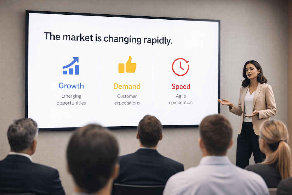
3. Data Storytelling Instead of Data Dumping
Data storytelling in presentations focuses on explaining insights through narrative and visual hierarchy rather than displaying raw numbers.
Rather than showing everything, modern data slides highlight:
- One key insight per chart
- Clear explanatory headlines
- Contextual annotations
- Simplified visuals
This approach helps audiences understand why the data matters, not just what it shows.
4. Depth-Based Visual Design (Subtle 3D & Layering)
Depth-based presentation design uses subtle shadows, layering, and gradients to create structure and hierarchy without visual noise.
Flat design has evolved into layered design. Light shadows and card-based layouts help separate content and guide the eye – especially on screens of varying sizes.
The emphasis is on subtle depth, not dramatic 3D effects.
5. Purpose-Driven Motion and Micro-Animations
Purpose-driven motion uses subtle animations to guide attention and explain transitions rather than entertain.
Motion is used sparingly to:
- Reveal content step by step
- Emphasize relationships
- Simulate flow in asynchronous decks
Over-animated slides are avoided because they distract and reduce accessibility.
6. Personalized and Audience-Adaptive Presentations
Personalized presentations adapt content, visuals, and examples based on audience type and context.
Designers now create modular decks with:
- Replaceable case studies
- Audience-specific examples
- Adjustable depth of detail
This allows one core presentation to serve multiple stakeholders effectively.
7. Brand-Led Presentation Design Systems
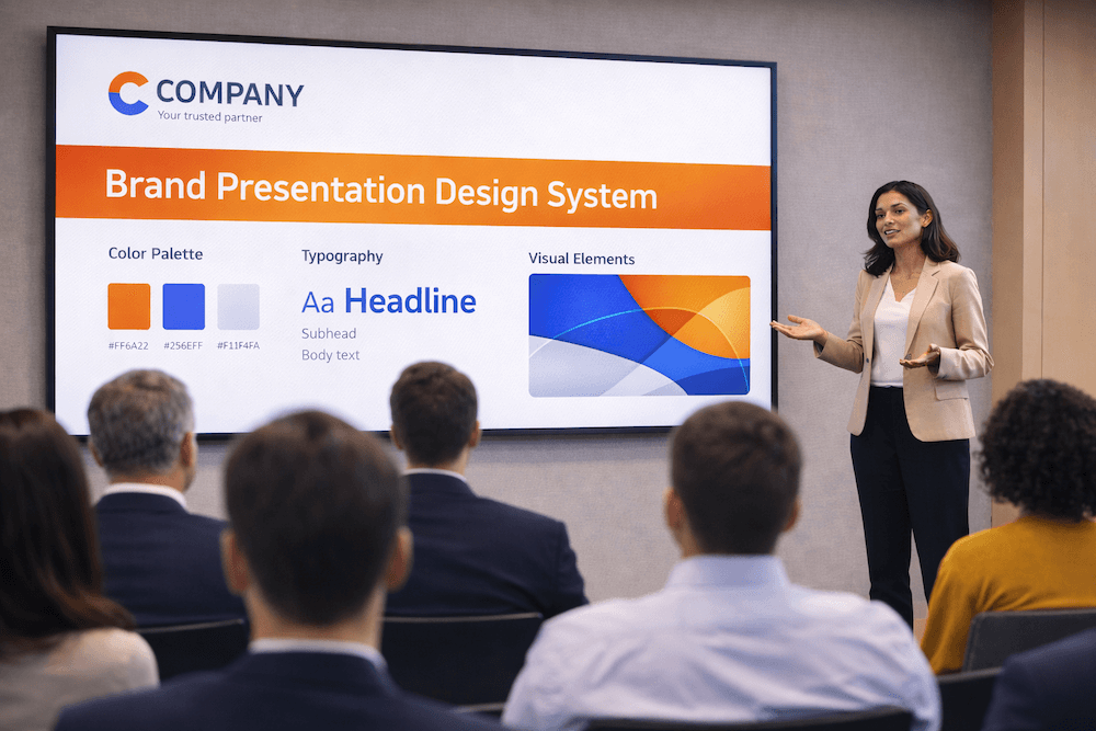
Presentation design systems standardize layouts, fonts, colors, and components to ensure brand consistency across all decks.
In 2026, presentations are treated as brand assets, not disposable files. Design systems help teams:
- Maintain visual consistency
- Reduce design time
- Improve brand recognition
This trend is especially common in corporate, SaaS, and enterprise environments.
8. Accessibility-First Presentation Design
Accessibility-first presentation design ensures slides are readable, inclusive, and usable by diverse audiences.
Key practices include:
- High color contrast
- Minimum readable font sizes
- Logical reading order
- Avoiding color-only meaning
Accessible design improves clarity for everyone – not just users with disabilities.
9. Bold Typography as the Primary Visual Element

Bold typography in presentations uses large, expressive text as the main visual driver instead of decorative graphics.
Typography-led slides are easier to scan and scale better across screens. In 2026:
- Headlines are larger and bolder
- Font pairing is minimal
- Decorative fonts are used sparingly
10. Storyboard-Style Presentation Structures
Storyboard-style presentations follow a clear narrative arc with logical progression and emotional pacing.
Slides are designed as part of a story, not as standalone pages. This improves engagement and retention.
The Hybrid Default: Designing for Room, Laptop, and Mobile Screens
Hybrid-first presentation design ensures slides are equally clear for audiences in the room, on laptops, and on mobile devices.
In 2026, hybrid is no longer optional – it’s the default. Presentations must work for:
- In-person audiences viewing large screens
- Remote attendees on laptops
- Viewers scrolling slides on mobile
Design implications include:
- Larger text and stronger contrast
- Fewer elements per slide
- Clear headlines that stand alone
- Reduced reliance on small details
If a slide only works when explained verbally, it needs improvement.
How to Implement Presentation Design Trends Without Sacrificing Clarity
To implement presentation design trends without losing clarity, apply trends selectively, prioritize message hierarchy, and test slides across devices.
Best practices:
- Define the core message before applying design
- Use trends to support – not replace – content
- Limit variation within a single deck
- Test slides on small screens
- Review slides without narration
Clarity should always come before aesthetics.
Role of AI in Modern Presentation Design
AI works best as:
- A productivity tool
- A layout assistant
- A brainstorming aid
It should not replace strategic thinking, storytelling, or brand judgment.
The Future of AI Presentation Design (2026–2030)
From 2026 to 2030, AI presentation design will become more predictive, adaptive, and personalized, while still requiring human oversight.
Key developments to expect:
- Real-time slide adaptation based on context and flow
- Audience-response-driven layouts that adjust emphasis dynamically
- Automated data interpretation with built-in narrative insights
- Ethical safeguards to protect originality and brand integrity
Despite these advances, human creativity, judgment, and storytelling will remain the primary differentiators in effective presentations.
Presentation Design Trends That Are Fading in 2026
(i). Text-Heavy Slides
Slides overloaded with text reduce attention and comprehension. In 2026, concise headlines and visuals communicate ideas faster and more effectively.
(ii). Generic Stock Imagery
Cliché stock photos feel inauthentic and add little value. Presentations now favor meaningful visuals that directly support the message.
(iii). Decorative Animations
Animations used only for visual appeal distract audiences. Modern presentations use motion sparingly and only to guide attention.
(iv). Overdesigned Transitions
Flashy transitions shift focus away from content. Subtle, simple transitions are preferred to maintain flow and professionalism.
Common Mistakes When Following Presentation Design Trends
1. Treating Trends as Rules
The biggest mistake is adopting a trend because it is “popular” rather than because it fits your message.
- The Pitfall: Using a “Bold Maximalism” trend for a somber quarterly financial report or a “Retro-Tech” vibe for a high-end medical pitch.
- The Fix: Always apply the Brand-Audience-Context filter. If a trend contradicts your brand’s personality or distracts your specific audience, discard it. Trends should be used as “seasoning,” not the main ingredient.
2. Overusing Motion or Effects
The growing ease of creating complex animations and depth effects in 2026 makes over-animating presentations a common risk.
- The Pitfall: “Animation Fatigue.” When every bullet point flies in and every slide transitions with a cinematic sweep, the audience loses track of the actual content. This also causes significant lag on slower devices or video calls.
- The Fix: Follow the Purposeful Motion rule. Use animation only to:
- Direct the eye to a specific data point.
- Show a relationship between two objects.
- Signal a major shift in the presentation’s narrative.
3. Ignoring Accessibility (Neuro-Inclusion)
Many 2026 trends, such as “Glassmorphism” (blurred backgrounds) or “Neon-on-Dark” palettes, can be a nightmare for accessibility.
- The Pitfall: Low color contrast that makes text unreadable for visually impaired users, or fast-flickering animations that trigger sensory issues.
- The Fix: Use the 60-30-10 Color Rule and always check contrast ratios. Ensure your font sizes remain legible (minimum 18pt for body text) and provide “Alt-text” for complex 3D models or images if the deck is being shared as a leave-behind.
4. Relying Entirely on AI Outputs
AI presentation tools in 2026 are powerful enough to generate an entire deck from a single prompt, but they often lack “strategic soul.”
- The Pitfall: The “Uncanny Valley” of presentations. AI-generated decks often feel generic, use “hallucinated” or irrelevant imagery, and lack the subtle narrative nuances required to close a deal or inspire a team.
- The Fix: Use AI for the Skeleton, not the Story. Use AI to generate layouts, suggest icons, or summarize data, but manually edit the “Hook,” the emotional core, and the final call-to-action. The human element is what builds trust.
FAQs
Q. What is the biggest presentation design trend in 2026?
A. The biggest presentation design trend in 2026 is clarity-first, audience-adaptive design. Slides are more focused, minimal, and structured around one key idea per slide, ensuring they work equally well in live, hybrid, and asynchronous settings.
Q. Are PowerPoint presentations still relevant in 2026?
A. Yes, PowerPoint presentations remain highly relevant in 2026. However, their effectiveness now depends on modern design practices, such as minimal layouts, strong visual hierarchy, accessibility, and storytelling, rather than traditional text-heavy slides.
Q. Are bright colors recommended for presentations in 2026?
A. Bright colors work best as accents. Neutral backgrounds with strategic highlights improve focus and readability.
Q. What font types are best for modern presentations?
A. Clean sans-serif fonts dominate due to readability and scalability. Decorative fonts should be used sparingly.
Q. What is the ideal font size for presentations?
A. Headlines should typically be 36-48 pt, while body text should be at least 18-24 pt for readability.
Q. Are dark mode presentation themes effective?
A. Dark mode works well for screen-based and data-heavy presentations but requires careful contrast management.
Q. How important is AI in presentation design?
A. AI plays an important supporting role in presentation design by improving speed, structure, and consistency. That said, AI is most effective when paired with human judgment, as strategy, storytelling, and audience understanding still require human input.
Q. What makes a presentation future-ready?
A. A future-ready presentation is clear, adaptable, accessible, and scalable across devices. It uses strong narrative structure, modern visual design, and flexibility for different audiences while remaining easy to update and reuse over time.
Final Thoughts: Designing Presentations That Last Beyond 2026
Presentation design trends in 2026 emphasize clarity, adaptability, and intentional design. The most effective presentations are those that balance modern tools with timeless communication principles.
Trends should guide decisions – not dictate them. When presentations are designed with the audience, context, and message in mind, they remain effective long after 2026.
