
There is no denying that great stories make great presentations, but what makes them greater is the way those stories are visually depicted. It is truly an art to convert data into powerful visuals that can captivate the audience, keep them on their toes, and create an impact as well. Thus, it is extremely crucial to harness the power of visuals and create stunning presentations.
Here are a few tips to incorporate data visuals in your presentations that can help you notch up your game –
1. Focus on the Design
The most important aspect of a great visual is its design. While data plays an important role, so does embedding a great design. You can start by sticking to your brand theme to differentiate yourself in the market, using complementary colors and fonts, selecting the right alignments, etc.
2. Don’t Overdo – Incorporation
Excess of anything is often harmful, and so are visuals. Do not incorporate too many visuals in your presentations. For instance, if certain pieces of information can be explained conveniently via text, do not try to fit them into a bar or a graph.
3. Remove Unnecessary Elements
When you use data visuals, ensure that your slides are clean and free of any unwanted elements. This can be anything from shadows, unnecessary texts, extra information, or any other illustrations that could steal the stare.
Make sure you leave ample white space, explain your graphics in a few words or a couple of bullet points, and keep the slides minimal and tidy.
4. Pick the Visual that Supports Your Story
It doesn’t matter if you have the best story with you until you choose a means of narration that adds to the value of that story. Using the right visual is extremely crucial as it can determine whether your audience will understand it or not.
Types of Data Visualizations
1. Dashboards
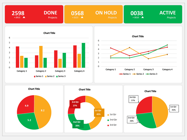
If you want to provide a comprehensive view of any project or company development, a dashboard is the right tool for you. It displays a summarized overview with the help of charts and graphs, compiled data, and collective statistics. This allows you to get a bird’s eye view of a huge amount of information.
2. Tables
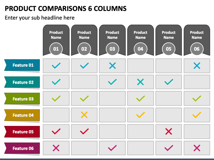
If you want to stay at the top of your game, you need to stay updated with the best storytelling methods for your data and information. Though tables are an age-old way of depicting data, crafting them creatively can help you level up your game.
While tables allow you to organize data into rows and columns, organizing them in an appealing manner can help you display data better. For instance, create rows and columns according to hierarchy, use appropriate colors for negative and positive values, and leave enough space between cells to allow visual comfort.
3. Charts & Graphs
Charts and graphs are of various types and can be used for multiple purposes. Often, they are used to depict large quantities of data compiled into a smaller visual. For instance, bar charts are an excellent means to compare different types of data, such as sales for various years, the performance of employees over time, etc. Line charts can be used to display differences in data, such as that between actual and expected sales.
Each chart can be a fruitful tool if used strategically for the right set of information.
4. Maps
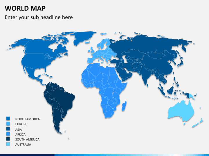
Maps are an excellent tool to depict your company’s presence geographically. Using maps can be extremely strategic when it comes to pitching meetings and client acquisitions. Depicting your company’s topographical presence can stun your investors and leave your clients in awe.
You can experiment well with maps by using different color shades. For instance, you can use darker shades on regions with a higher volume of sales, followed by lighter shades in ascending order. This would create an extremely appealing visual and intrigue your audience.
5. Timelines
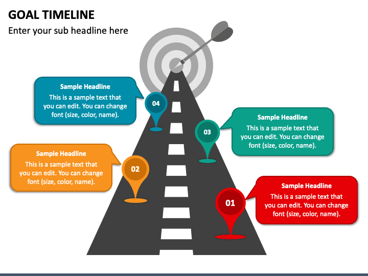
If you want to share chronological information, there is no better way to depict it than using timelines. Whether it is your company history, future predictions, or projects, timelines depict the growth and allow your audience to comprehend easily.
Timelines are dynamic and can be used for innumerable purposes. Not only do they build trust among customers and clients, but they also create a sense of legitimacy.
Conclusion
Next time you are assigned to put together a presentation, make sure to follow the above-mentioned techniques to incorporate visuals flawlessly into your slides. When you begin to shift from basic texts and paragraphs to graphs and intriguing visuals, you will notice a rise in audience engagement and participation. It will also improve your design skills and make you a better presenter overall.


