If the visual presentations that accompany more than 90 percent of the world’s speeches could be dismantled and crushed into tiny pills for insomniacs, every continent would be full of well-rested people.
Sadly, we continue to blame the tools, not the carpenters.
We say PowerPoint is boring, Prezi is no better and SlideRocket and Wix just don’t work for most people.
The issue is not the tools, but the use we are making of them.
Knowing what we are doing wrong is the road to getting it right the next time.
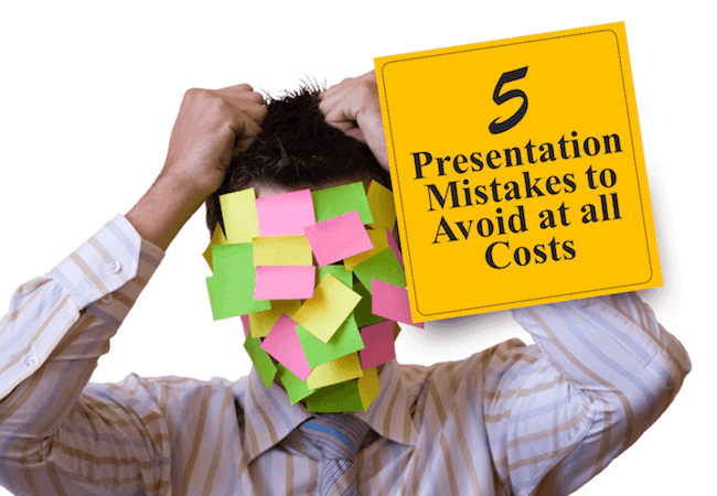
Here are five of the most common mistakes presenters make with their visual presentations and how to fix them.
Mistake #1: Starting with the wrong intent
The visual presentation to your spoken words is like an accompanist to a solo musician. It is not on equal footing with you, the star of the presentation. It should not to play so loudly that your words are lost and the attention turns to image, not you.
It certainly is not there to double as a teleprompter in case you forget the words. Nor is it there to add value for your clients so they can have your whole presentation in a written form when you are done. That is solved by typing up your remarks and distributing them as a take-away or offering people a link to your website where they are featured.
If you are using your visual presentation in any other role than to accompany you and enhance the tone and timing of your presentation, you have got it wrong.
How can you fix this?
Go over your visual presentation and ask yourself honestly, “what is my intent in this visual presentation?” If it isn’t to have an accompanist to add impact and excitement to crucial points of your presentation, it needs to be rebuilt.
Mistake #2. Allowing too much text onto your slide
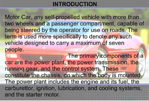
Your speech is not supposed to be appearing in written words on a slide behind you so people can read it faster than you speak it.
The rule of how many words are acceptable varies between six and 10. If you have more than that, you have moved into the danger zone where people will just read the slide and tone you out.
For some examples of how boring text-heavy slides can look, checking out this presentation – “Text Heavy Slides Are Boring”
How can you fix this?
Look at your text-heavy slide. What is the one key message on it that you want people to remember?
Drop everything else.
If there are two points that seem equally important, create a second slide.
Consider if the words of text could be represented by one effective photo or illustration.
Remember that the best accompanist to words is visual, not more words.
Mistake #3. Your background and type colors are wrong
If you have ever sat at the back of a room and tried to see the type on a slide that featured dark colored text on a dark background, you will understand that some colors just don’t go together.
Dark on dark is the most obvious mistake.
How can you fix this?
To make your slides easy to read, use more visual contrast.
The easiest colors to read are black type on a white background. If you reverse it and have white type on a black background, remember to increase the size of the font.
If shades are too light, avoid them. You will not be able to read light blue type on white from the back of the room, for example, or white on yellow.
Experiment with colors and try to see them yourself from a distance to get a clearer idea of what is easy to read.
Mistake # 4. Your images don’t match the story you are trying to tell
If your only resources for images are free websites, you may find yourself on occasion resorting to cartoon figures or illustrations that just don’t match your message.
For example, imagine if you were doing a presentation on the challenges impacted the dairy industry and one of problems was a disease that cows contacted. You need a picture of a cow, but instead of finding a sick cow or even cows in a meadow, all you can come up with quickly is a cartoon cow.
The image does not support the seriousness of the story, and that will turn off your readers and viewers.
How can you fix this?
Seth Godin, author of Permission Marketing and several other books suggests in his free downloadable ebook “Real Bad PowerPoint (and how to avoid it),” that you invest in as little as $3 an image and go to places like istockphoto.
Sites that offer banks of copyright free photos can also be accessed using Pixabay and Morguefile, among others.
Here is a link to download Godin’s book: http://www.sethgodin.com/freeprize/reallybad-1.pdf.
Mistake # 5. Avoid placing text over photos.
You lose the impact of your image and your words become illegible when you lay one over the other.
Inserting type over text is a key mistake made by amateur designers who are happy to have learned how to do this and forget that it is for one or two words at the most.
How can you fix this?
Never do anything with words that hampers the enjoyment and impact of an excellent photo or illustration.
Remember that the picture is there to illustrate your words, to add emotional impact to them.
A picture is indeed worth a thousand words when it is relevant to the subject being discussed. If you are discussing the need for people to help children in developing countries, for example, don’t show a flow chart of how money moves from their pockets to the people in need.
Instead, show the children asleep on dirt floors, show them without shoes, or lined up to see a doctor volunteering to help them.
On a final note, don’t end your presentation with a text-heavy summation of key points. End it with a dramatic photo or single quote that people will remember because of its simplicity.


