Want Beautiful PowerPoint Presentations? It’s Easy When You Follow These 7 Rules

It’s almost a miracle if a person can get through life without having to sit through one, let alone many, boring and ugly PowerPoint presentations. For most of us, these less-than-thrilling presentations are a part of our everyday lives.
What’s worse is when we are the very people who subject others to ugly PowerPoint presentations. But the good news is, you don’t have to create bad slides any longer, and you don’t have to be a professional designer to turn out some awesome looking presentations.
If you want to start dazzling your audience instead of lulling them into a deep slumber, consider following these 7 PowerPoint presentation rules.
White Space is Your Friend

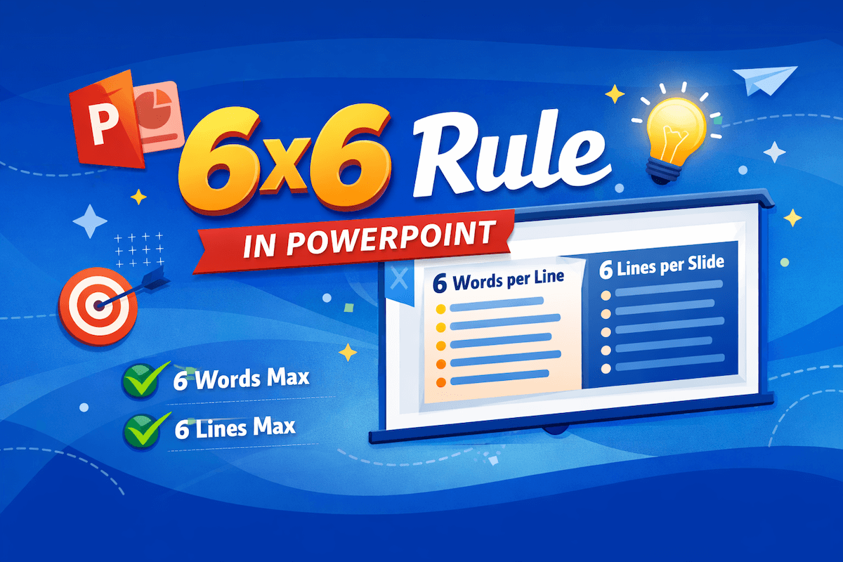
One of the biggest no-no’s of creating PowerPoint presentations is to try and cram too much information into one tiny slide. This not only results in a sloppy, cluttered presentation, but it forces your audience to try and read your presentation instead of listening to YOU.
White space is your friend, and there should be plenty of it on your slides. Taking a “less is more” approach will help your audience focus on one key point at a time. To keep your slides tidy, have no more than five bullet points on each slide and be sure to keep word count for each bullet point down to five words or less. This is called the 5X5 rule and it works, so use it!
Use Keywords, Not Sentences

There may be times you don’t want or need to use a list of bullet points to get your main point across. That’s fine, but it in no way means you should ever write a full sentence or two on your card, for the exact reason I mentioned above. Remember, slides are meant to reinforce your main ideas. But you the speaker should be the one to deliver most of the content and information to your audience. The listener should not get said content by reading sentences off your slides.
When developing your presentation, remember to pare down your core message and use keywords instead of sentences to convey it. Unless quoting someone else, never put a full sentence on your slide.
Use Layout to Control the Flow of Information

In Western societies, content is read from left to right, top to bottom. Why interfere with your audience’s natural reading pattern? Use it to your advantage and make sure your layout directs people’s eyes in a very deliberate way. You want to lead them to key parts of your slide that highlight your main message. Don’t underestimate the power of layout, it is a simple but effective way of controlling the flow of information.
When it Comes to Choosing Colors – Keep it Simple

Sure, people like colors, but that doesn’t mean you have to use every single one in your PowerPoint presentation. A good rule of thumb here is to stick with simple light and dark colors. Really bright or neon text will only cause eye strain (and mild annoyance) in your audience, so stay away from using them.
Generally speaking, light text on a dark contrasting background (white on black) or dark text on a contrasting light background (black on white) is your best bet. Of course, if you are presenting on behalf of your brand, you’ll want to use some of your brand’s colors as well. This could mean using white text on a navy blue background and green bullet points if your brand’s colors are primarily blue and green.
Limit Your Fonts
When it comes to which fonts to use, choose wisely. Traditionally, serif fonts (Times New Roman, Garamond, Bookman) are best for printed pages, while sans serif fonts (Helvetica, Tahoma, Verdana) are easier to read on screens. Having said that, it might be worth it to take a look through Google Fonts to add a bit more typographic personality to your presentation. No matter which font you choose, be sure to limit it to one or two choices. Also, make sure the style of your font matches the tone of your presentation.
Avoid Overdoing Things
It’s natural for you to want to make your message stand out – to make an impact. Typically styling text, either by using a different color, bold or italics works best. After all, these styling tricks help draw attention to your key points. Just be sure you don’t overdo it with styling choices or your presentation will look amateurish and busy.
Go Large or Go Home

When it comes to choosing font size, you should go with at least 30pt. Not only will this size ensure that your audience doesn’t have to squint and lean forward to read your slide, it will force you to include only the most important information to include.
The next time you design a PowerPoint presentation, be sure to follow these 7 rules to create something that looks great and gets your message across.


