
Do you know even the smallest details can make or break the impact, effectiveness, and credibility of your presentation? In this context, you must understand that font choices matter, and any slightest blunder can ruin an otherwise groundbreaking presentation, costing you or your business the opportunity of a lifetime.
Let’s understand the importance of choosing the right font considering a scenario. You are a senior executive in a company and have been assigned a presentation (to be delivered next week) that is of utmost importance to your business. You don’t want to leave any stone unturned and work relentlessly on content, visuals, structure, and delivery.
You choose a beautiful and aesthetic font. But somehow, forgot to test its readability, alignment, and compatibility.
On the big day, as you present your slides on the wider screen, you realize that the fonts are not displaying as intended. And seeing this, you lose your confidence and end up making your presentation delivery a complete mess. Do you think your company will trust you next time for such big opportunities?
Fonts reflect the crux of your message and the professionalism of your presentation. So, choose them thoughtfully.
In this article, we have listed 11 mistakes that presenters must avoid while selecting fonts for their presentations. Let’s have a look!
Font Mistakes to Avoid in the Next Presentation
1. Using Too Many Fonts
Many times, for the sake of making the presentation look more innovative and creative, presenters use excessive fonts. Instead of giving your slides a unique appeal, this practice makes them look unprofessional, cluttered, and visually chaotic. It, in turn, creates confusion among the audience.

How to fix the issue?
Limit your font choices to two or three at most. Use these fonts consistently throughout your presentation. For example, you can use one font for headings, a second font for body text, and a third for quotes or captions. To create a visual hierarchy, you can use the same font in different styles, weights, or sizes.
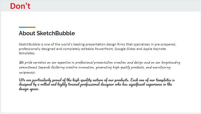
2. Choosing Similar-Styled Fonts
Selecting fonts of the same style or weight for headings and subheadings makes your presentation uninspiring and lifeless. The audience may face difficulty in demarcating the various content sections (title, body, and conclusion) on the slide, and in the process, they fail to understand the central message.


How to fix the issue?
To add more engagement and depth to your content and create a clear visual hierarchy, choose fonts with different weights and styles. For example, you can pair a delicate script font with a bold sans-serif font.
3. Neglecting the Contrast
Not highlighting the important information from the rest of the content is one of the biggest mistakes presenters usually commit. As a result, it becomes difficult for the audience to comprehend the key points of your presentation.


How to fix the issue?
Add more contrast to your content by choosing fonts with varied styles, sizes, and weights. It will help the audience figure out the crucial elements and better resonate with your message.
4. Ignoring the Essence of the Message
Not choosing the fonts in alignment with the essence and tone of the message can backfire and diminish the overall efficacy of the presentation.
How to fix the issue?
Fonts play an important role in eliciting different emotions and communicating the gravity of the message. So, be mindful of the intended emotions you want to trigger and select fonts accordingly.
For example, if you want to present a business proposal, instead of using decorative fonts, go for classic serif to reflect professionalism. On the other hand, if you want to deliver a presentation on Christmas, Holi, Halloween, or any other fun-filled event, a whimsical script font will be an appropriate choice.

5. Turning a Blind Eye to Readability
Overlooking the readability aspect of fonts impacts the visual design of your presentation, making the audience struggle to read the words on your slides. As a result, they will give up after a few moments and shift their focus to their phones or chatting with other attendees.


How to fix the issue?
To ensure the excellent readability of your content, consider the following two aspects-
a). Alignment and Spacing
Tightly packed fonts with no white space make your text unreadable. While widely spaced fonts represent a lack of content and give an impression that the presenter has attempted to cover the space on the slide.
Therefore, prioritize consistency of alignment and spacing of font to optimize readability and add visual interest to your slides. It gives a balanced look to your content and directs the audience’s focus to essential details. Moreover, the right spacing and alignment make your presentations easily accessible to the audience with visual impairment or cognitive disabilities.
b). Font Size
The size of fonts helps create a visual hierarchy. You can differentiate the headline from the body text by using different font sizes for both. The recommended font size for headings is 18, and for body text is 14. However, you can choose font size, taking into account the screen size and the distance of the audience from the screen.
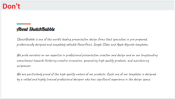
6. Using Unnecessary Artistic Effects
One of the common mistakes presenters make is overusing fancy fonts to give a creative flair to their slides. But, as opposed to it, these artistic fonts ruin the readability and professionalism of your presentation, minimizing its credibility.

How to fix the issue?
Use artistic fonts sparingly in the right context so that they can best complement your information. Also, maintain a balance between aesthetics and legibility when using these fonts to ensure visual grace and readability of the text.
7. Disregarding Visual Hierarchy
Not considering the visual hierarchy while choosing fonts will crumble the aesthetics of the presentation and appeal of your message. In addition, it will make it difficult for the audience to decide which points to focus on first and how to comprehend and process the presented information in a structured manner. They will consider the whole information at the same level of importance, and your core message will get lost in this ‘whole.’
How to fix the issue?
To give your slides the visual impact they need, choose the right font size and color.
a). Font Size
Use heavy and large text for headings and titles, taking the size down for supporting information. You can further reduce the size of fonts for footers or captions.
b). Font Color
Choose font colors that complement the theme of your presentation and best contrast with the background of the slides. Irrelevant colors will make your design unattractive and distract the audience.
Stand a few feet back from the screen and check your slides. If you have to make an effort to read the text, it implies a need to adjust the background and font colors for clear contrast or adjust the font size or both.
8. Using Fonts that are Too Trendy
Choosing an unconventional font just because it is currently in vogue may prove a wrong decision sometimes. So, select fonts that genuinely go well with your overall presentation design and convey your message as intended.
How to fix the issue?
Instead of choosing an unconventional font just because it is currently most popular, select fonts that genuinely go well with your overall presentation design and convey your message as intended.
9. Overusing Italicized or Bold Fonts
Italic or bold fonts add emphasis, create contrast, and give typographic hierarchy to your content. However, overusing or misusing them affects readability, and your important information gets lost. It also overwhelms your audience.

How to fix the issue?
Use bold and italicized fonts strategically, moderately, and sparingly to enhance your presentation.
Consider using bold fonts in the following scenarios-
- to highlight important headings, phrases, or keywords that you want your audience to remember. You can also make your recommendations, findings, crucial terms, and conclusions stand out by showcasing them in bold.
- to create a contrast between different information types, such as opinions and facts.
- to indicate changes or transitions in tone.
Consider using bold fonts in the following scenarios-
- to draw attention to phrases or words with different statuses or functions.
- to present abbreviations, technical terms, and foreign words.
- to show acknowledgement for other’s work.
10. Overlooking Branding and Consistency
Using fonts that are not aligned with your company’s color, style, logo, or other branding elements can impact brand recognition, identity, and message.
How to fix the issue?
Go through your company’s brand guidelines and choose the fonts that align with them.
11. Not Checking the Compatibility
Most presenters make a mistake by using downloaded or customized fonts in their slides and not checking them on the system (on which they are going to present on the big day). If the system doesn’t support the fonts you have used, it either turns the fonts to default settings or shows something unusual that the audience won’t be able to comprehend.
How to fix the issue?
Check your fonts on the system of the meeting room or conference room ahead of time to avoid the last-minute hassle. And if you want to use the customized fonts, save your text as an image.
The Bottom Line
As a presenter, you make your best effort to showcase your information with clarity. In this context, the right choice of fonts can enhance your visual communication and influence how the audience perceives and understands your message. Besides this, fonts help create unique branding, draw the audience’s attention to the important text, trigger the intended emotion, and make the visual experience delightful.
Therefore, when choosing fonts, you must prefer professionalism over aesthetics. Also, understand the psychological effects of various font types to make informed decisions.


