Do you know what is the most crucial aspect of decision-making for an organization? It’s the timely and data-driven insights into their financial and operational performance.
Each department of a company has its own data, and senior executives and managers usually don’t have enough time to sift through emails, stacks of reports, and spreadsheets of each department. The lack of concrete data-driven insights compels business leaders to make decisions based on intuition, which leads to missed opportunities, inefficiencies, and financial setbacks.
Well, a comprehensive dashboard presentation can be a game-changer here. It helps consolidate the fragmented data and provides a unified view of inventory, production, finances, sales, and other data, depicting the current state and performance of the organization. It also empowers decision-makers to decide on a future course of action to fill the gaps and achieve the desired outcomes.
In this article, we have covered detailed information on the benefits, elements, and steps of creating an impactful dashboard presentation. We have also provided the best pre-designed templates that you can use in case you don’t have plenty of time to create a presentation from scratch.
Let’s begin!
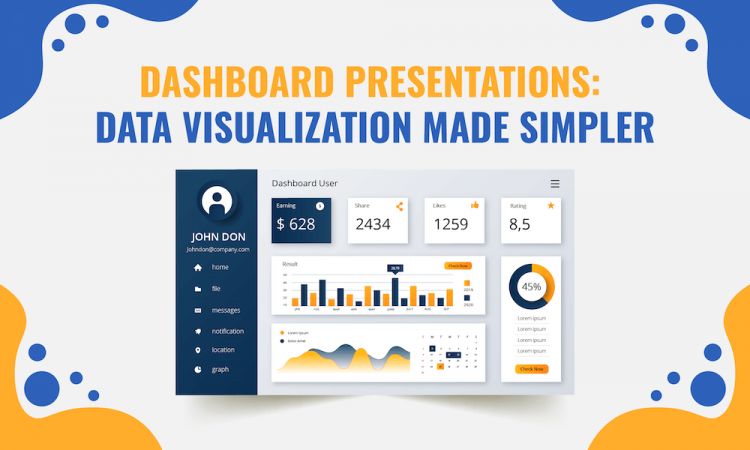
Dashboard Presentation: What is it?
A dashboard presentation is the visual representation of the metrics, KPIs, market trends, customer behavior, and the most important information of various organizational departments or a specific process or project in a concise, unified, and easy-to-understand manner for the purpose of data analysis and making informed choices and actions.
Benefits of Dashboard Presentations for Your Business
a). Better Decision-Making
As a head of marketing, sales, HR, operations, or finance, you can showcase the performance of your respective department to the senior management, providing them with valuable insights into areas that are doing good and the areas that need improvement.
For example, marketing professionals can create a dashboard presentation to present information related to website traffic, advertising campaign performance, and conversion rates. This at-a-glance visualization of information helps management avoid many hassles (requesting a report from the marketing head, waiting for the report, thoroughly analyzing the report to identify improvement areas, etc.) and enables them to make the right decision instantly.
b). Improves Accountability
Through a dashboard presentation, you can present the performance comparison of different individuals, teams, and departments, which boosts healthy competition and enhances accountability. You can also communicate who will be responsible for a specific metric, data point, or outcome.
In a nutshell, with these presentations, you can visualize to your team members the benchmark they have to achieve individually and as a team, giving them a clear understanding of what they are accountable for.
c). Keeps Your Team Aligned
Organizations can reap lots of benefits, such as better communication and cohesiveness, improved morale and efficiency, and higher productivity if they have an aligned team. In this context, dashboard presentations are better options than emails.
Dashboard presentations are an effective communication tool to keep your team members on the same page, solicit their inputs and ideas, and show them the roadmap to achieve goals in alignment with the broader objective and vision of the company.
d). Easy Evaluation of Progress
Dashboard presentations provide a visual snapshot of goals and KPIs, which helps senior managers quickly assess the progress of an individual employee, project, department, or business unit transparently. Based on evaluation, they can figure out the roadblocks and make strategies to overcome them for the smooth achievement of pre-decided goals.
e). Saves Resources and Time
It’s tedious and time-consuming to check the detailed reports of different departments, analyze them thoroughly to identify trends and lacunas, and connect the dots to make a decision. Many resources (each team member, department heads, etc.) are involved in the report-making and formatting.
Dashboard presentations help you save valuable time and resources by showcasing updated information about each department and other data in a well-formatted and structured manner at a glance.
Designing Amazing Dashboard Presentations
Elements to Include
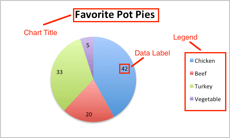
(i) A Title
Add a title to your dashboard presentation. It should be at the top center or top left corner. Keep the title short.
You can also add a subtitle if you feel it is required to make the audience understand the essential information.
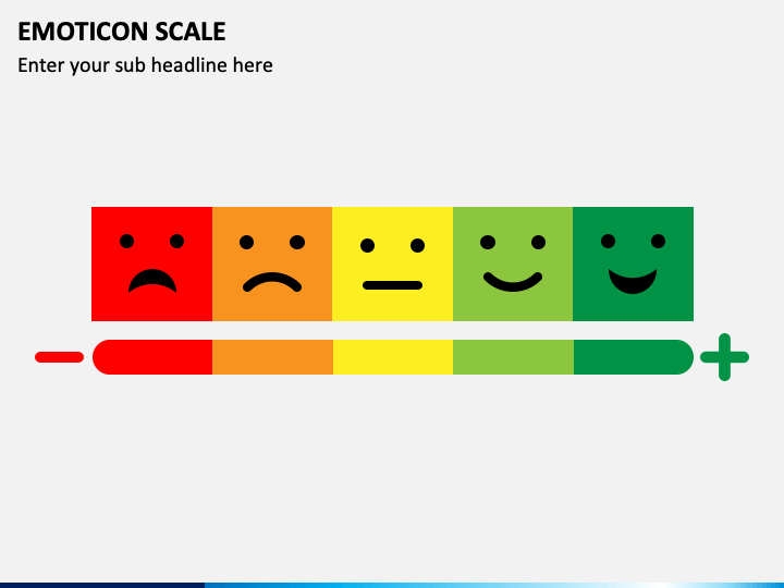
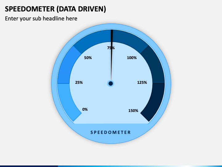
(ii) Visual Metaphors
It’s not always necessary to show your data with just charts and numbers. You can use emoticons, icons, color labels, and other visual metaphors to make your presentations stand out.
For example, you can show the positive and negative results of customer satisfaction surveys in your Sales dashboard presentation through visuals of a thermometer, delighted and sad faces, up and down arrows or thumbs, etc.
If you want to present the project status, you can use the visual of a speedometer.
(iii) Legends and Caption/Chart Title
A legend is an element of the chart that tells the audience which symbols, patterns, and colors correspond to specific categories or data series in a graph. They are usually placed at the bottom or to the side within the chart area.
Captions are concise but comprehensive descriptions that describe the chart as a whole. They can be placed below or above the chart.
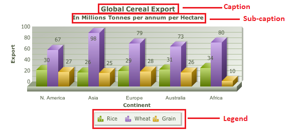
(iv) Labels
Labels showcase descriptions, values, or names for individual categories, elements, or data points within a chart. They are usually placed next to specific chart elements.
(v) KPIs and Metrics
KPIs and metrics are important to communicate discoveries, trends, and results. As the goal of each dashboard presentation is different, they may have different KPIs and metrics.
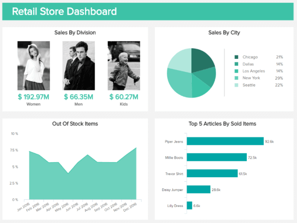
For example, if you want to present the analytics of a retail store in your dashboard presentation, the KPIs must focus on the sales by city, items, division, and out-of-stock items. It will help the audience understand the tendencies of stock-out items over time and the purchasing behaviors and habits of customers.
Steps to Create a Dashboard Presentation
a). Define the Goal/Purpose
The first step is to identify your audience, understand the context, and define the goals of your dashboard presentation. Your objective will help you tailor your message, structure your presentation, and decide the delivery style.
The purpose of your dashboard presentation could be to portray the performance of the overall organization or a specific business function/department/team, drawing attention to a specific business problem and inspiring action to overcome it, driving transparency, and retaining employees by showing their individual performance, etc.
b). Choose the Metrics Relevant to the Goal
Find the answers to the following 2 questions-
- Which metrics precisely and accurately measure each business goal?
- What details are apt for each metric?
Below are the examples of KPIs that you can use to show the performance of important business functions-
| Business Functions | KPIs |
|---|---|
| Sales | Trends over time, monthly sales growth, average conversion time, sales per rep, lead-to-sale %, average cost per lead, average purchase value, etc. |
| Marketing | Lead-to-customer ratio, customer lifetime value, organic and paid traffic, conversion rate, customer acquisition cost, mobile traffic, social media traffic, etc. |
| Project Management | Cost performance index, budget variance, resource profitability, average cost per hour, cycle time, planned vs. actual, etc. |
| Customer Support | Net promoter score, customer satisfaction score, total tickets, first response time, customer effort score, cost per resolution, average handle time, etc. |
| Financial Operations | Total income, total expenses, net profit, cash at the end of the month, net profit margin %, accounts receivable, accounts payable, quick ratio, current ratio, operating cash flow, etc. |
c). Present the Data
To present your data points in an organized manner, group them into relevant categories. It gives a visual hierarchy to your dashboard presentation and makes it effortless for the audience to do cognitive analysis.
Consider the following points while organizing many KPIs in your presentation-
- Use colors with care. Highlight the negative performances in higher contrast to instantly attract the audience’s attention.
- Use whitespaces to make the information readable.
- Be mindful while choosing the fonts and their variations (light, bold, normal, etc.). You can follow the branding guidelines of your company in this context.
- For similar data sets, use the same visualization types.
- Ensure that the labels and legends are equal in size.
- Align each data point neatly, avoiding overlapping.
- Avoid using styled or colored text if it is purposeless.
d). Choose the Right Layout
Usually, the audience reads the information presented on a screen or page from left to right. Gain insights into where your audience will likely look first and accordingly place your data. You can showcase the chosen layout to your friends or colleagues to get their feedback and make changes before you present it to the intended audience.
Tip- You can also follow the relevant UX laws to design an awesome dashboard presentation.
Tips to Ace Dashboard Storytelling
1. Make it Audience-Centric
Put yourself in your audience’s shoes to outline your story according to their goals. The better you know your audience, the more effectively you can meet their expectations.
Learn the following things about them-
- Who are they?
- What tasks do they perform on a daily basis?
- What are their requirements, needs, or expectations?
- What is the main takeaway your audience will draw from your dashboard storytelling?
The answers to these questions will help you craft the relevant content outline for your story.
For example, assume your target audience is the customer support team that manages customer queries and issues. The team members will be interested in listening to your story if it revolves around the critical issues, the impact of implemented solutions, KPIs (response time, customer satisfaction, operational cost, etc.), gives them insights into how the team has contributed to the business growth and how they can improve further.
2. Add an Emotional Appeal
When the statistics and data presented in charts and graphs are narrated with an emotional touch, it gets itched in the audience’s mind for a longer time. You can add personal life experiences, anecdotes, culturally shared moments, etc. You can also use evocative language to trigger emotional responses among the audience.
For example, if your sales have increased by 20% in this quarter, instead of saying it in simple words- “20% increase in sales,” say it with more impact- “sales hiked by a remarkable 20%, bringing excitement and joy to our team.” And while communicating this information, your pitch must reflect your enthusiasm and excitement.
Expert Tip- If you are weaving emotions in your data story, ensure that you are not manipulating or overshadowing the integrity and accuracy of facts.
3. Keep it Simple
Weaving and narrating a story consisting of several data points, jargon, and complexities will leave your audience perplexed, and they won’t be able to put it to good use. So, avoid irrelevant points or tangents. Choose clear visualization and simple words to make your dashboard presentations accessible to more people.
Craft a clear and understandable narrative that flows logically from beginning to end. Use a structured format, like “cause-and-effect” or “problem-solution-benefit,” to provide guidance to your audience.
4. Provide Context
You can’t create an outstanding story based merely on data that lacks context. The context acts like an anchor in your data story that keeps the audience engaged and motivates them to act on your message.
Tell your audience what your story is about and why they must pay attention to it.
For example, suppose your dashboard presentation is about the status update of a project. You can set the context by clarifying the scope and significance of the project. Your story must ground the current scenario in the past while encouraging the audience to imagine the future update. Keep your story optimistic while covering the setbacks.
5. Make it Interactive
You can make your boring dashboard presentations interesting and fascinating by adding interactivity. You can do so by allowing the audience to raise their questions and asking them to share their feedback.
Adding interactive elements is important if your presentation has a broad target audience. It aids in onboarding newcomers smoothly and provides opportunities for the experienced audience to get in-depth insights.
6. Strike a Balance Between Words and Visuals
Too much content or too much visuals- both are detrimental to your presentation. So, aim to strike a balance between words and graphics. If you want your audience to drive your message home and remember it for longer, use graphs and charts sparingly, ensuring they are consistent, accurate, and clear.
To make your presentation design more breathable and avoid clutter, add white space around visuals and text. You can also use different alignments, fonts, colors, and sizes for visuals and text to create a hierarchy.
10 Best Dashboard Presentation Templates for Your Business
Below is the list of the 10 best dashboard templates that you can use in your business presentations. The dashboards are linked to Excel. When you right-click on any chart or graph of the dashboard, Excel will show up. Click on Edit with Excel, enter your data there, and you are done. The dashboard will get updated automatically.
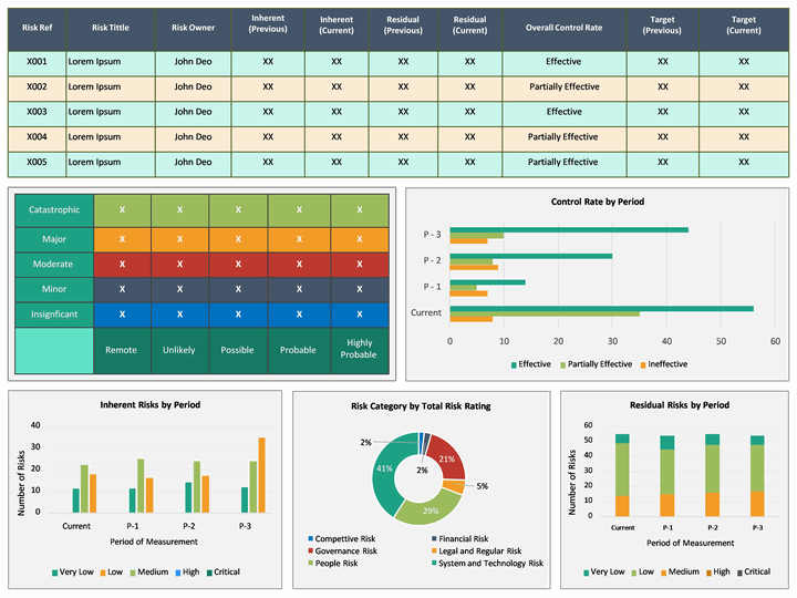
1. Risk Management Dashboard
Use this template, featuring tables, bar graphs, line charts, donut charts, and pie charts, to showcase information related to various aspects of risk management in a visually appealing manner.
The colorful illustrations empower risk analysts and managers to portray the risk heat map, risk rating breakdown, action plan breakdown, inherent and residual risks by period, risk category by total risk-taking, control rate by period, and much more.
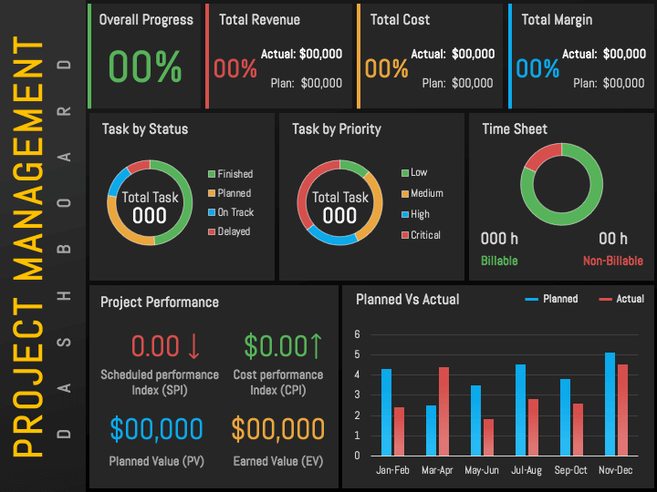
2. Project Management Dashboard
Project managers can visualize the big picture of their project to team members, management, and clients in an easy-to-understand way with this beautiful slide featuring bar graphs and donut charts.
Incorporate it in your presentations to highlight the project’s overall progress, performance, task by status and priority, total revenue, total cost, and time sheet. You can also provide an overview of planned and actual outcomes.
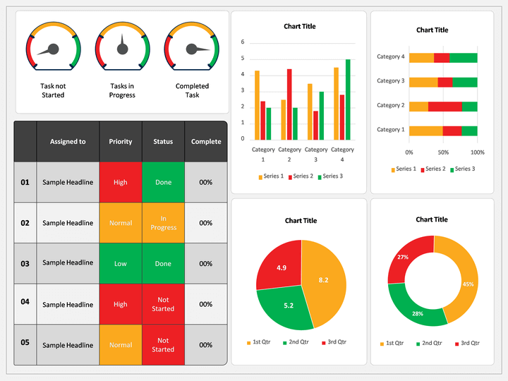
3. RAG Dashboard
This dashboard template enables the project managers to depict the status of various activities and tasks of a project in Red, Amber, and Green color.
You can leverage the tables and chart diagrams to present not started, in progress, and completed tasks. You can also showcase the responsible person, priority level, completion percentage of each task, and the outstanding issues. In case you are managing multiple projects in parallel, you can highlight which project is done, on hold, and active.
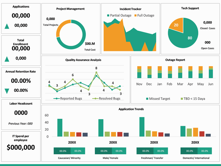
4. CIO Dashboard
Represent the important indicators and metrics of your organization’s IT systems, functions, and programs to help chief information officers get an overview of the daily operations and evaluate whether they are meeting the business objectives or not.
IT heads can use this template to depict top risking applications, daily network traffic, average server utilization, IT spend per employee, average storage per GB, quality assurance analysis, critical events and incidents, response time, and much more.
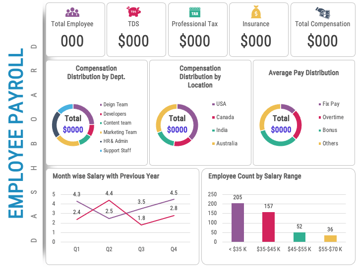
5. Employee Payroll Dashboard
HR managers can show the company’s payroll data in a gripping manner using this PPT.
The slide is adorned with captivating colors and beautiful graphics. Use it to present information related to total employees, TDS, professional tax, insurance, total compensation, employee count by salary range, compensation distribution by department and location, average pay distribution, etc.
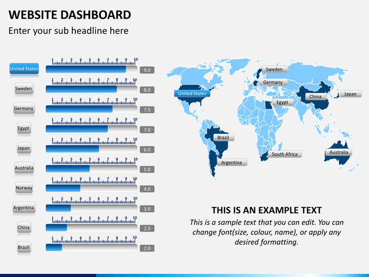
6. Website Dashboard
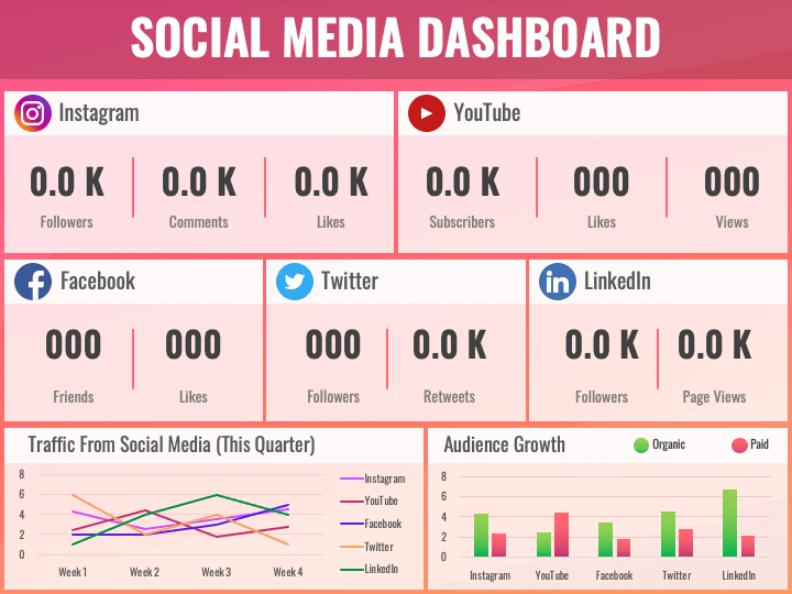
7. Social Media Dashboard
This slide is ideal for social media managers to visualize the performance of social media posts and ad campaigns on Instagram, YouTube, Facebook, Twitter, and LinkedIn.
You can incorporate it in your monthly or quarterly review presentations to showcase a detailed analysis of traffic from social media at a specific time, paid and organic audience growth on different social media platforms, and metrics (likes, followers, comments, etc.) that indicate the engagement of users with your content on social media.
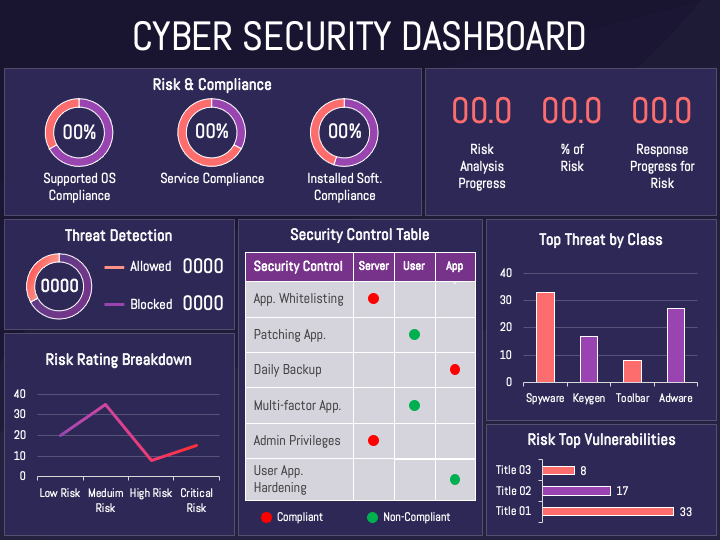
8. Cyber Security Dashboard
This PPT is apt for portraying the cybersecurity posture and resilience of your organization. It is a time-saving visual aid for security officers to showcase their information in a splendid way.
Using this slide, you can visualize an overview of risk and compliance, top threat by class, top vulnerabilities, threat detection (allowed and blocked), risk rating breakdown, and security controls.
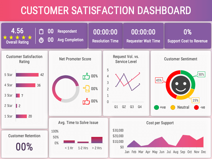
9. Customer Satisfaction Dashboard
With this graphic-rich PPT, you can provide visibility into the customers’ satisfaction level with your company’s offerings. You can also showcase survey results and the performance of your customer support team.
Leverage the slide to present the overall rating, customer sentiment, net promoter score, support cost to revenue, cost per support, average time to solve issues, customer retention, and much more.
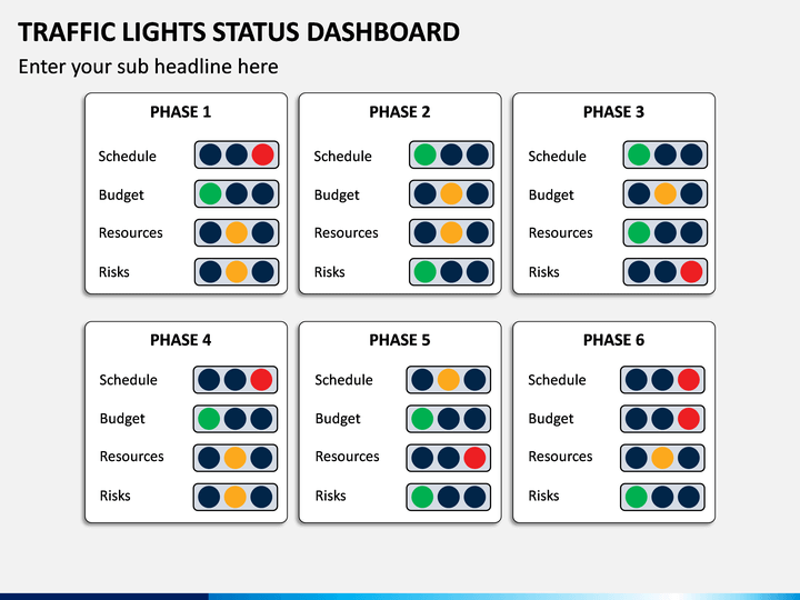
10. Traffic Lights Status Dashboard
This PPT is apt for showcasing the status of various tasks of a project, individual employee’s performance and behavioral attitude, and much more. Professionals from different domains can use it in their own way.
For example, if you want to show the employee’s behavioral attitude, you can depict normal behaviors with green color, behaviors that need to be changed (otherwise may turn offensive) can be depicted with orange color, and offensive behaviors (that can lead to legal actions) can be represented through red color.
Closing Thoughts
Why make your reports lengthy, dull, and uninteresting when you can make them captivating, interesting, and visually appealing by presenting them using beautiful charts and graphs?
With dashboard presentations, you can streamline and simplify your reporting process and narrate the story of your success, performance, and accomplishments like never before. Focus on making data visualization clear and interpretable to get the most from your dashboard presentations.
Would you like to add your input to the above-shared information? Do let us know in the comments.


