
Colors play an extremely important role in marketing and branding. Choosing the right set of colors can help communicate your message in a meaningful and artsy manner.
Let us understand a little bit about color psychology through this activity – name the emotion that crosses your mind when you imagine green, red, and white colors.
- Green- you’d think of nature, environment, calmness, etc.
- Red-your mind will instantly think of passion, love, and excitement.
- White- you can’t stop thinking about peace and tranquility.
This is how our mind reacts to different colors. Hence, it is necessary to use the right set of colors in your presentations to effortlessly deliver the message.
Here are a few such tips that you can use colors professionally in your next presentations.
1. Use Your Brand Palette
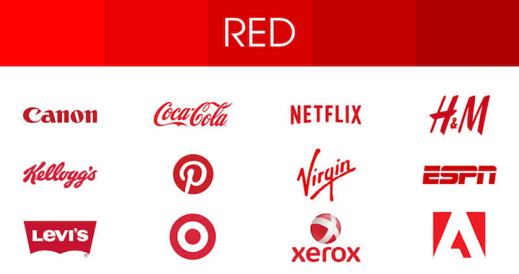
Think of a company when we say the word ‘Red.’ The first name that would come to your mind would be YouTube, Canon, or Coca-Cola. This is the power of using a brand palette or colors specific to your own brand.
You can also choose unique colors according to the message that you wish to impart. For instance, if you want to convey an environmental message through your company, you can opt for colors such as blue, green, brown, etc. If you wish to depict a vintage theme, you can opt for shades of beige and brown.
2. Establish a Theme

Presentation themes are an integral part of designing stunning slideshows. Establishing a theme is all about defining the colors that you wish to use throughout your presentation. These could be multiple colors from one family, shades from various families, or even monochromatic colors.
Colors in your theme can help define the emotion of your presentation. Thus, choosing the correct one can trigger the right emotion in your audience.
One of the best ways to create your own theme is by choosing hues of the same color family. For instance, if you want to play with the color Red and its variants in your presentation, you can do this by browsing for ‘HEX Codes for Red Shades.’ You will find a list of color codes for your theme. You can copy the codes and use those shades for your presentation.
3. Harness the Power of Salience
Salience is one of the most important qualities that make an object stand out from others in a presentation. Once you master control over salience in your visuals, your audience’s eyes will never get off the presentation!
Let us understand this with an example – consider you want the audience to pay attention to a red circle on your presentation. There are two slides – first is where you place the red circle on a slide that has multiple other circles of similar shades. Second, where you place it on a slide that has all grey circles and just one red circle.

Which one will capture the audience’s attention immediately? Obviously, the second one! This is how salience works and can be used to highlight important visuals in your slides.
4. Throw Some Contrasting Colors to Highlight
One of the best ways to highlight information is by using contrasting colors.
For instance, if your slides are all blue, you can use orange color to highlight important pieces of information in your presentation. This will give your slides a splash of contrast and will make your data pop out.
Conclusion
Using the right set of colors is extremely crucial to deliver a stunning presentation. However, if you find it difficult to create presentations from scratch, you can use pre-designed Presentation templates and save much of your time and energy. These templates are available in various color themes and can be customized as per your choice of shades as well.
We hope these tips help you create an outstanding presentation with the right set of colors!


