
PowerPoint Slides are a bit like fire: they can either really help a situation (as in heating your house and cooking your food) or really hurt a situation (as in burning down an entire forest or town). In this way, determining how helpful or harmful PowerPoint will be has little to do with luck or chance and everything to do with how you use it.
If you want PowerPoint to be helpful and not harmful to your presentation, avoid the following mistakes:
Crowded Text
Salt, fat, sugar. What do all of these have in common with your slides’ text? When it comes to the health of your body or the health of your presentation, less is more.
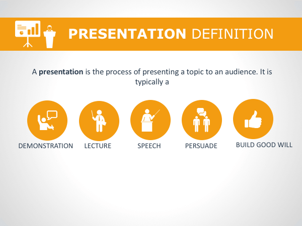
A lot of text is distracting. It forces your audience to stop listening to what you say so they can read what you wrote. But they’ll be distracted from reading what you wrote because you’re talking at the same time – so no message gets through! Also, a lot of text on your slides is just boring to look at.
Keep your slides as empty as possible. Use images or icons to portray concepts and when using bulleted lists, keep it to only four or five points.
Wacky Fonts
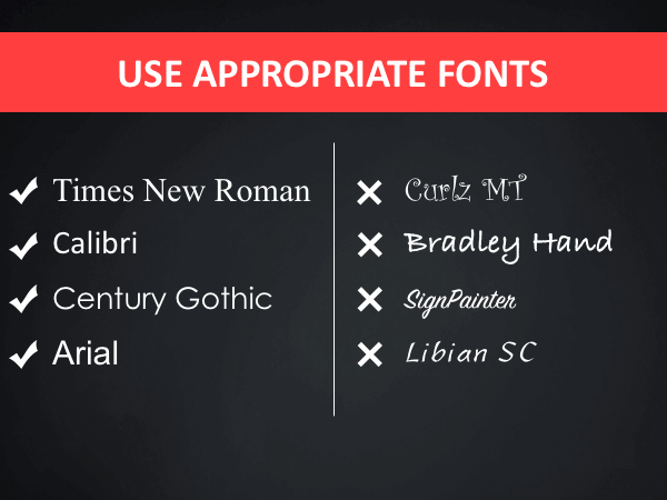
Though they may seem a creative choice when it’s 11:57 pm and you’re trying to finish your slide presentation, wacky fonts should be avoided like mosquitoes and humidity. When it comes to text, don’t think, “How can I be creative here?” think “Which font is most legible?”
Your best bet is to stick to simple fonts like Times New Roman, Calibri, Century Gothic and good ol’ Arial. Fight the urge to use fancy fonts. Fight it with all you’ve got.
Using Too Many Colors

Along the same lines, you may assume that to create visually stunning and eye-catching slides, you should use all the colors of the rainbow. But what happens when you mix a bunch of different paint colors? You generally end up with something that is very unpleasant to the eye.
It is best to limit your color palette to one or two dominant colors. How do you choose which colors will work best for your presentation?
What is your topic about and what would you like your overall message to convey? Colors have meaning associated with them. For instance, red conveys energy while blue is serene and calm. Yellow is associated with joy and happiness, while green symbolizes growth and harmony.
Using Bad Images

Too many people try and get away with using free clip art for their PowerPoint presentations. Not only does this give your slides a rather… cutesy and tacky feel, but often the clip art does not have the power to convey your story.
Good presentations offer a bunch of hopefully-relevant information to the audience, but great presentations tell a story that moves an audience to take action.
Stay away from cheap (or free) tacky clipart and go instead with stock images or infographics that help you inspire your audience by adding value to your story.
Not Centering Your Information
Typically, presenters don’t know what the room looks like until they get there. Maybe there is a wall that will block some audience members from seeing the entirety of your slides. Maybe there is an immovable table in front of you, and so those in the front row can’t see the very bottom of your slides.
To ensure all of your supplemental content is “seeable” by everyone in the audience, make sure you don’t place important information out at the edges of your slides but rather center that information.
Reading Your Own Slides Out Loud
Have you ever been to a presentation where the speaker essentially spent half an hour reading their PowerPoint slides? It’s pretty awkward.
Your PowerPoint slides are supposed to supplement your presentation, not be the star of the show. Too many presenters use the slides as a crutch, instead of preparing ahead of time. Staring at the screen and reading your slides is annoying and highly unprofessional.
Not Having a Backup
Let’s face it, at some point in your speaking career, something is bound to go wrong with your presentation. You’ve spent so much time preparing an awesome presentation, it would be a shame not to be able to share it with your audience. Make sure you back up your PowerPoint slides onto a zip drive. Should your laptop battery die and you’ve left your charger in your hotel room, you can borrow someone else’s laptop and be good to go.
Be sure you take every effort to make your PowerPoint presentation work for you so it doesn’t destroy your overall message.


