
Market research seems a grueling task, but it’s the most important aspect to consider to ensure the product’s success and keep your organization heading in the correct direction. In addition, market research helps you divulge the latest trends, current market scenarios, customers’ requirements and expectations, and untapped opportunities.
Do you know what’s more crucial than doing market research and compiling the findings and data in a report? Well, it’s presenting these findings and quantitative data in an understandable manner so that your stakeholders can take actionable insights and make the right decisions at the right time. Any pitfall in putting forward this data can ruin your efforts, leaving your stakeholders in confusion and preventing them from driving value from the nuggets you’ve uncovered.
So, how to present your research data impactfully?
A well-thought-out and structured presentation can help you communicate a visually appealing data story to your audience, helping them comprehend it precisely. However, you will have to put some time and effort into crafting an engaging presentation, but it’s worth the appreciation you will get.
In this article, you will learn how to create your market research presentation like a pro.
Here we go!
Ingredients of an Engaging Market Research Presentation
a). The Relevant Text
When you complete your research, you have loads of facts, figures, and information to share with your audience. But remember, all kinds of data are not valuable for all audiences.
For example, if you are presenting to senior executives and decision-makers, they would want you to show key takeaways and high-level insights instead of assumptions and methodology.
Overbrimming your slides with too much data will make them look cluttered and overwhelm your audience. Your audience will struggle to find the data that is most suitable to them and will start paying more attention to their phones than to your presentation.
So, include only relevant information that matters the most to our audience.
b). An Appealing Background
Assume a scenario – you are sitting in a presentation which is about research findings on eco-friendly and sustainable practices. This session is an hour long. As the presenter displays the first few slides, you realize that the slides have a plain white background with no design and variety. Won’t you start feeling mentally exhausted after 10 minutes, knowing that you have to sit through for 55 more minutes?
The slide backgrounds are crucial but the most neglected design element of your presentation. By using the right background with the right color, designs, and shapes, you not only enhance the visual appeal of your slides, but also reinforce your textual message and lead your audience’s eyes to your content.
Choose the background wisely; it must not superimpose the information and visuals in the foreground. For instance, you can showcase your research findings on eco-friendly and sustainable practices in an engaging manner using this background-
c). Relevant Layouts
You can understand layout as the anatomy of your presentation, which includes the slides’ order, format, text placement, etc., and helps you break text-heavy slides. The layout you choose impacts the comprehension and retention of information by the audience.
The similar layout slide after slide makes your presentation look monotonous. So, don’t be afraid of using a variety of icons, images, texts, and other visual elements to give a creative appearance to your layouts.
For example, to make your research presentation on eco-friendly and sustainable practices more impressive, you can use the following different layouts with the same background –
d). Perfect Color Combinations
According to research, the first thing that the audience takes note of in a visual is its color, and 62-90% of the first impression is made on the basis of colors. Thus, by choosing colors thoughtfully in your research presentation, you can enhance the decision-making of the audience.
The choice of colors depends on many factors, such as your audience, brand personality, and presentation objective.
For example, if you intend to encourage your audience to take action, you can use orange and red colors for call-to-action. If you want to present research data for pitching high-end and wealthy customers, you can use purple, grey, and black, as these colors denote luxury.
e). High-Resolution Graphics
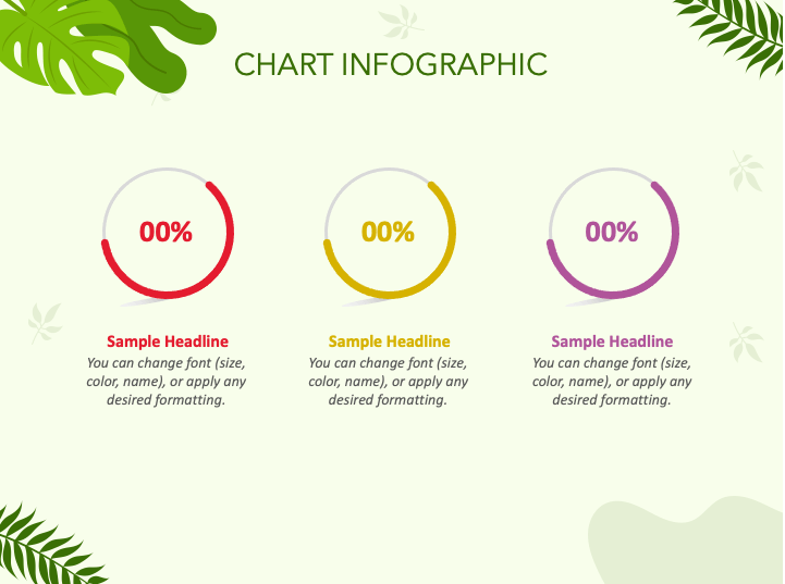
Your research presentation comprises several pieces of information, such as trends, relationships between different data sets, increase/decrease in sales, comparison of data, etc., which can be better showcased through graphics rather than communicated through text/words. By graphics, we mean diagrams and charts, graphs, tables, etc.
Graphics help you provide a visual summary of your key research findings in a comprehensible and efficient manner, making your slides look more organized and presentable.
Make sure the infographics you choose for your presentation have high resolution so that the audience can clearly view the presented information even if they are sitting far from the screen.
Also, the infographics should be relevant to the content and must enhance its meaning. For example, if you want to present the performance difference between two or more groups, a bar graph is the right pick. On the other hand, use a pie chart if you want to display the contribution of each department to the overall success of the organization.
f). Clear Fonts Hierarchy
Fonts are also an integral part of your presentation design. Follow the below-given tips to create a clear font hierarchy-
- Don’t use smaller fonts because it will impact the audience’s readability.
- Avoid handwritten and script fonts, as they affect your research presentation’s legibility.
- For clearly demarcating headings and body text, use different text sizes for them. For example, you can use 40 points for the title, 24 for subheadings, and 20 for body text.
- Pair fonts wisely. For example, serif fonts go well with sans-serif.
Steps to Create Your Market Research Presentation
1. Define Your Purpose
Do you want your audience to validate a current approach, support a new approach, or make informed decisions on the future direction?
Remember, each presentation is delivered with a purpose. Understanding that goal or purpose is of the utmost importance for directing your effort in the right direction and crafting the core message or key takeaway for your audience.
To define your purpose efficiently and effectively, consider finding answers to the following questions-
- What problem, pain point, or issue did your presentation address?
- What was the methodology and scope of your research?
- What was the unexpected and most important finding of your research?
- What recommendation or implication did you derive from your research finding, and how it relates to your audience’s needs/objectives?
2. Understand Your Audience
Audiences attend a specific presentation with an intent, which may be to get information about new trends, connect the dots to make the right decisions, increase their knowledge, listen to or seek expert guidance/opinion on a particular problem/situation, etc.
The better you understand the concerns and goals of your audience, the more likely you are to tailor your research presentations according to their preferences and build a quick rapport with them. And this connection and bond between you and your audience will make a difference in your presentation, making it a successful endeavor.
The main factors to consider during audience analysis are – their interests, pain points, demographics, knowledge, and expectations.
3. Structure Your Research Data
Now you have an understanding of the purpose of your research presentation and audience, it’s time to organize your information in a meaningful, coherent, and logical manner.
You can structure your presentation in the following 3 parts-
- Introduction
In this section, showcase the following information related to your research-
- Purpose
- Background
- Context
- Main points that will be covered
- Body
Present the following information in this section-
- Findings and recommendations using charts, graphs, and other relevant infographics.
- How you reached conclusions and how they are relevant to the pain points and objectives of the audience.
To make your content easy to process for the audience, use different fonts for headings, subheadings, and paragraphs. You can also use bullets and transition effects to make this part look more eye-pleasing.
- Conclusion
In this section, you can present-
- Summary of the main point
- The key message
- Recommendation
- Benefits of research for the audience
- Solutions to limitations and potential risks
- CTA (Call to action)
Tips to Make Your Presentation Delivery Impressive
1. Use Anecdotes
By opening with anecdotes and creating a memorable instance, you can set the scene for presenting your research data and findings and enhance the curiosity and interest of your audience.
Make sure your anecdote is short and crisp and should not exceed 60-65 seconds. Also, it must be relevant to the central message you want to convey.
2. Narrate a Story Around Your Findings
If your research presentation has something that can make your audience worried or overwhelmed, tell it through a story rather than presenting it straightforwardly. Stories make it easy for the audience to process disturbing and unsettling facts with ease, making them personally invested.
Get creative with your story and keep tracking the audience’s reaction while narrating it.
3. Create Suspense
“What will happen to the universe in the future?”
After this, be silent for a few seconds. And then present your findings.
You can create suspense and a sense of anticipation among your audience by adding thrilling information. To add more interest, you can use your gestures and body language (voice tone and volume, silence, pauses, etc.).
4. Add an Element of Surprise
You can make your presentations memorable by revealing a surprising fact.
Suppose you want to present your psychology research findings on anxiety. You can start your presentation this way –
“Anxiety has a crucial role in human functioning.”
As anxiety is considered a negative emotion, this statement will surprise your audience and make them curious to know how being anxious can be positive for humans.
5. Use Analogies
Power your research presentation with analogies to help your audience understand the logic and connection between complicated data sets. An analogy, if used rightly, taps into the prior feelings, experience, and knowledge of your audience and drives action and decision-making. Contrary to this, a weak analogy can backfire and may leave your audience in confusion.
Thus, avoid using misleading or false analogies, inappropriate sources, and clichés.
6. Move at the Right Pace
The too-fast or too-slow pace can make your presentation boring for the audience as they won’t be able to understand the message in either case. So, pace your voice according to the nature of the data you are presenting.
If you are presenting easy information, you can cover it speedily. But if you are presenting complex information, slow down the pace and take a pause to let the audience comprehend it.
You can improve the delivery of your research presentation by rigorously practicing and rehearsing it many times before the big day. Practice will enable you to build confidence, identify and work on flaws, and be prepared for difficult moments (audience questions, technical glitches, etc.).
The Bottom Line
The relevance and value of your research findings lie in its apt understanding by your stakeholders as intended and its timely utilization for business growth. So, leverage the power of data visualization in your presentations to make your audience realize the real value of the presented information.
A beautifully designed presentation, when delivered perfectly, can result in positive outcomes for the organization. Thus, don’t overlook the delivery aspect in the quest to design great slides.
Hope this article helps you make your future market research presentations more concise, precise, meaningful, and compelling that your audience will remember for a long time.


