
Google Slides is one of the best presentation platforms that allows users to access all elements to give their data and information a visual perspective and prepare gripping presentations in no time. One such element is the organizational chart, which is the best way to represent job responsibilities and reporting structures and align employees to the overall scheme of the organization.
In Google Slides, two basic methods exist to make an organizational chart. You can use the pre-formatted diagrams already available in the library or manually create each block as per your needs.
So, if you want to know about these methods and learn how to create an org chart, follow our step-by-step guide. So, here we go!
Using an Inbuilt Organizational Chart Template
Step 1: Open your Google Slides presentation and select the slide in which you want to add the org chart.
Step 2: Click the ‘Insert’ tab on the menu bar and select the ‘Diagram’ from the drop-down list. This will open a slide bar on the right depicting various types of diagrams; select the Hierarchy.
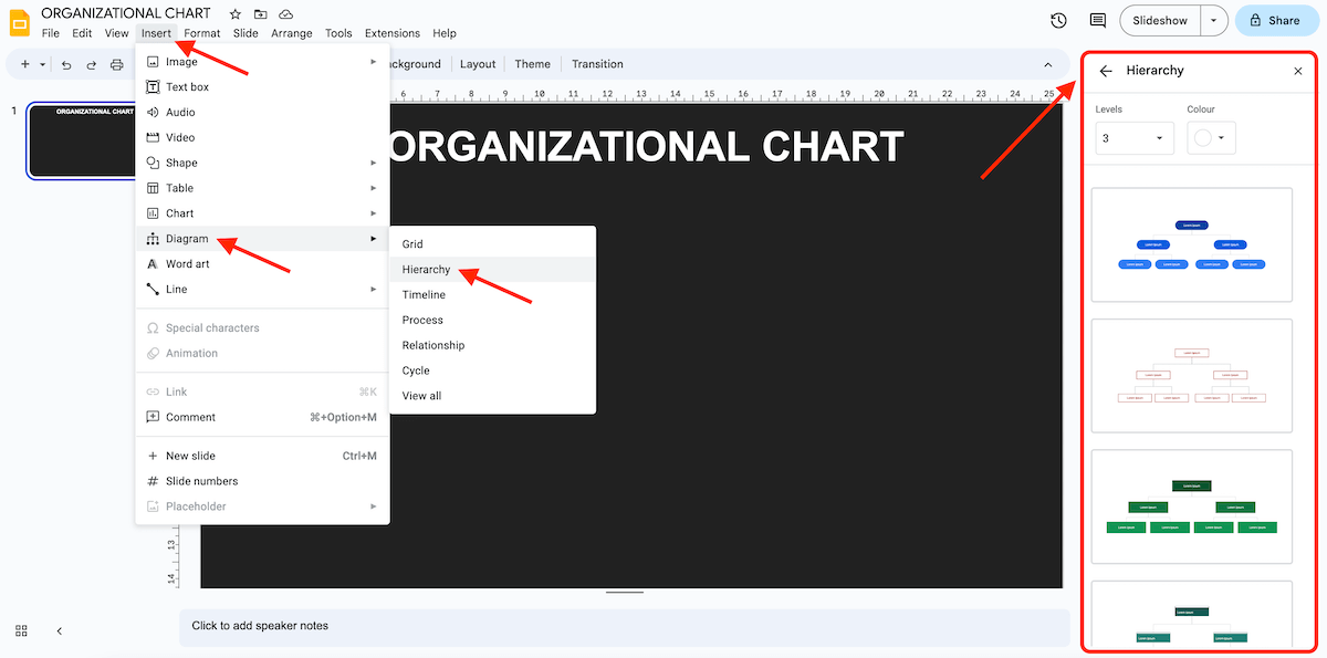
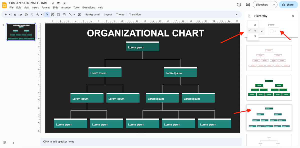
Step 3: You can choose the structure, add or remove the number of levels, and change the theme color of the chart as per your needs.
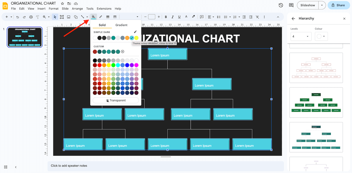
Step 4: Modify the chart elements using the option ‘Fill color or Border color.’ You can select one component at a time or all at once by holding the ‘Shift’ key.
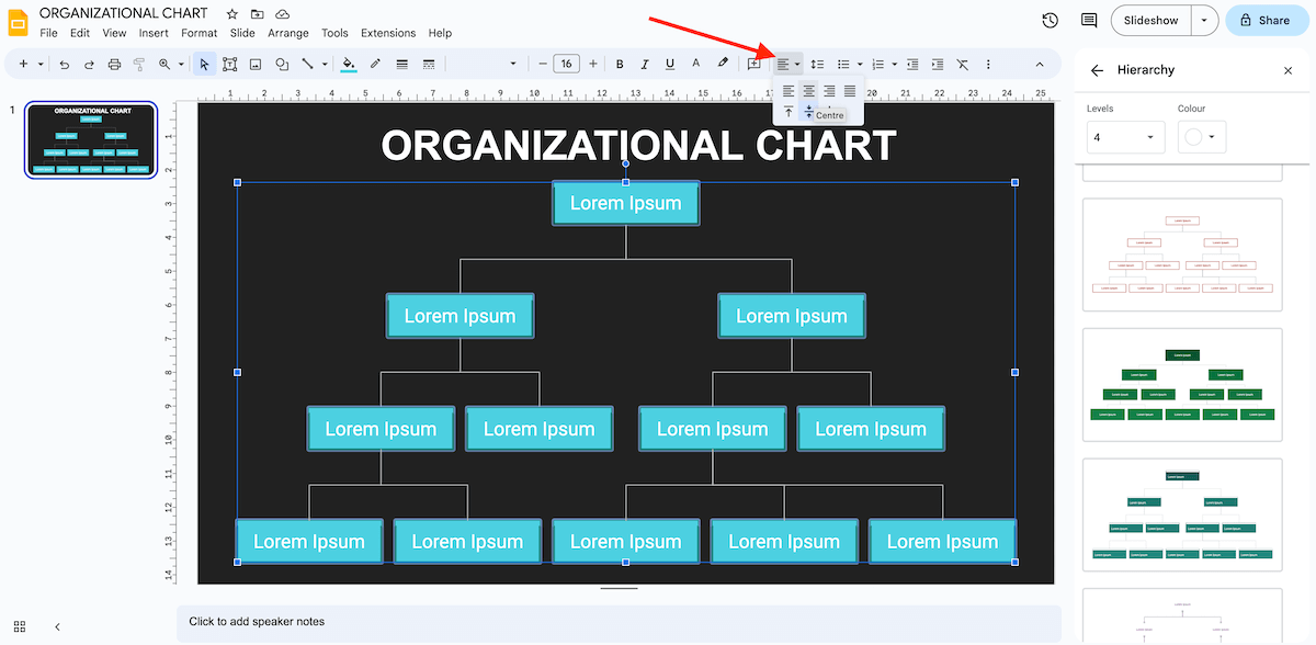
Step 5: Use options Font, Font Size, and Text color to style the texts according to the typefaces and colors in the template. All elements in the pre-formatted diagrams are already centrally aligned; however, you can still change the alignment using the Align option.
Creating an Organizational Chart Manually
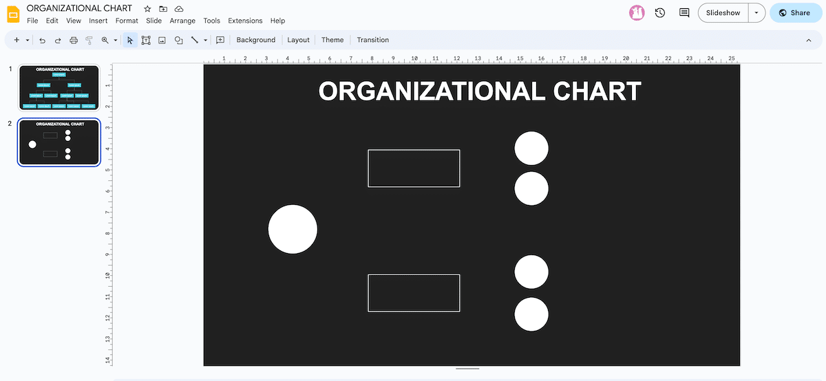
Step 1: Begin with defining your org chart’s layers, structure, and shapes. Here, we have taken a three-layer horizontal chart consisting of circles and rectangles.
Step 2: Go to the ‘Insert’ tab, click Shape > Shapes > Oval. Click and drag to create the selected shape.
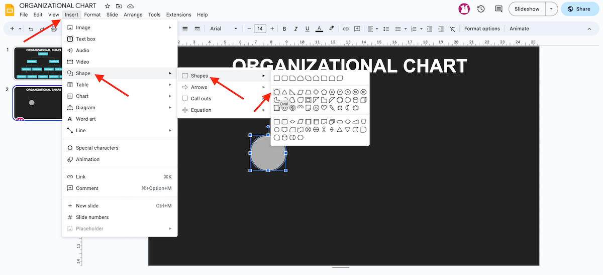
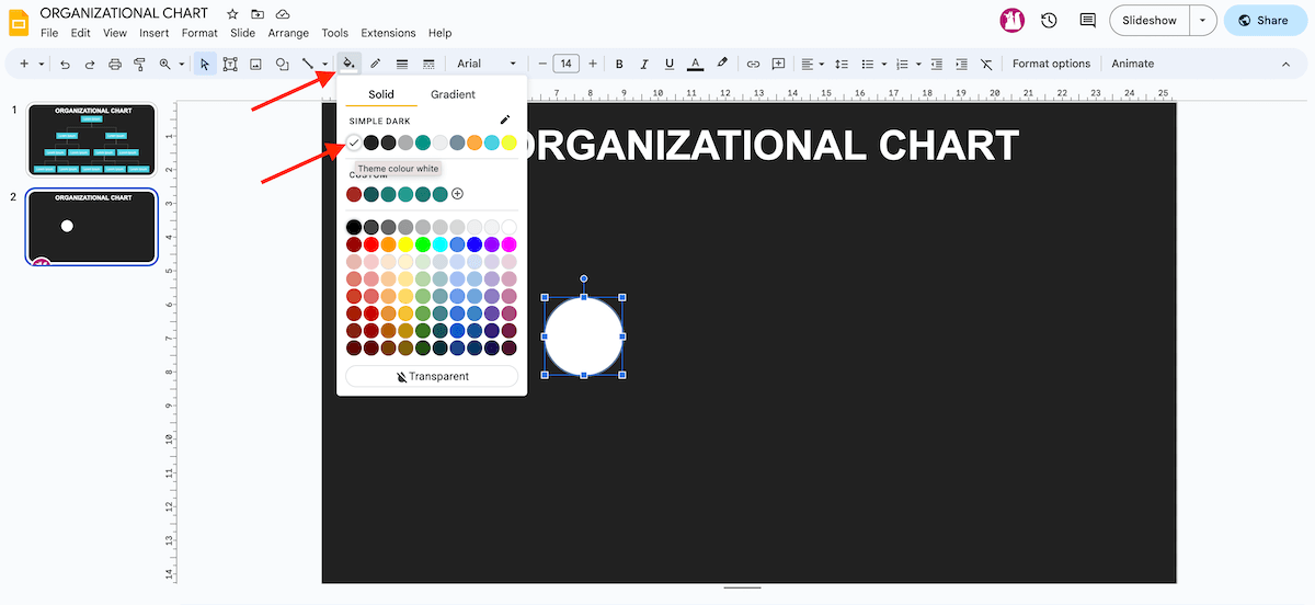
Step 3: Use the option ‘Fill color’ to change the color of the shape. Generally, the selected color should match the theme’s colors. Here, we have selected the Transparent option in the ‘Border Color’ tab.
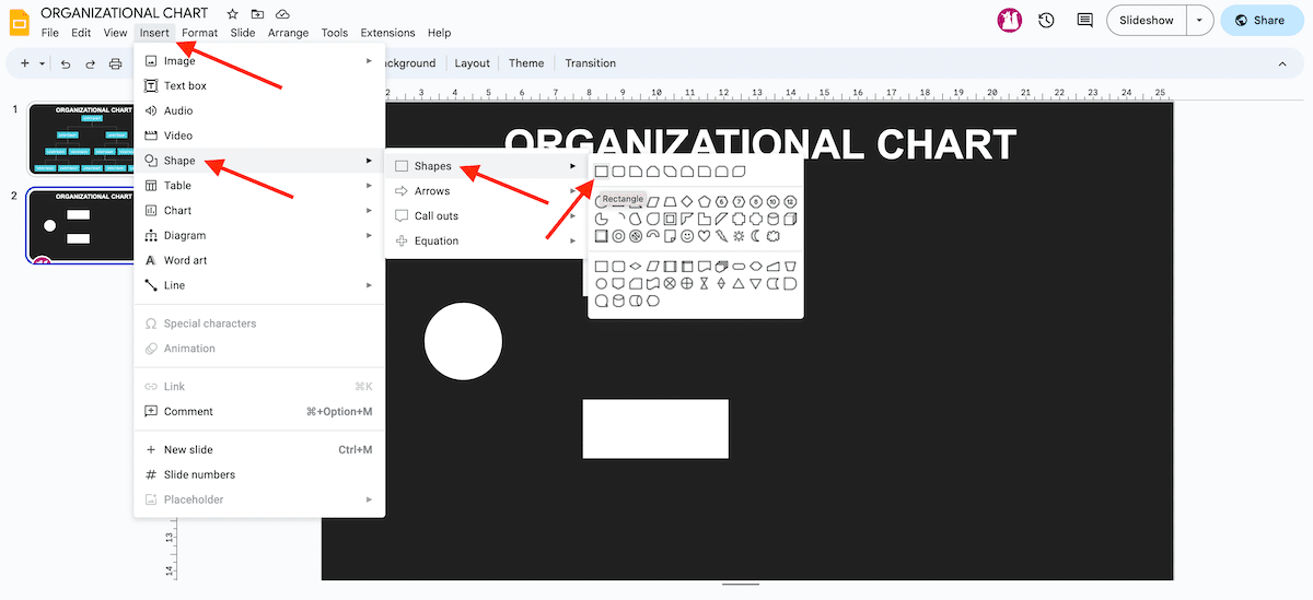
Step 4: Click Insert > Shape > Shapes > Rectangle. Select and drag the shape to create two rectangles. Place them as per your needs and create their copies by Ctrl C + Ctrl V in Windows and Cmd C + Cmd V in Mac. This will be the second layer of the org chart.
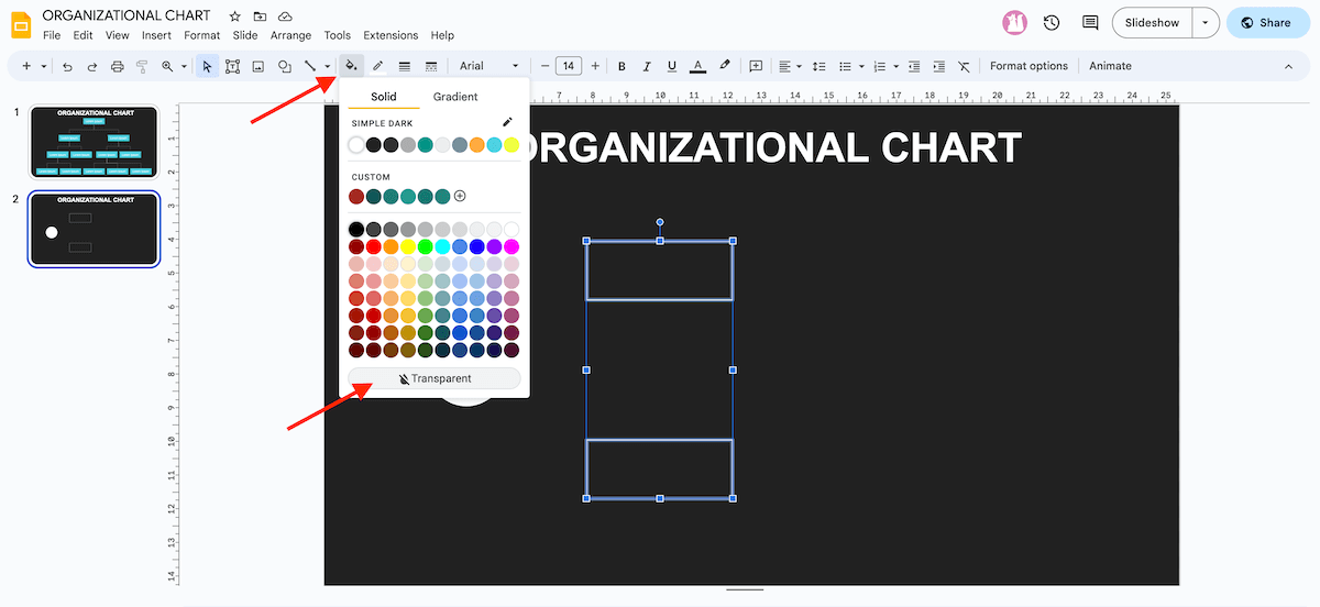
Step 5: Select both rectangles by holding the ‘Shift’ key or dragging the cursor over the elements.
Step 6: Change the color with the option ‘Fill color and Border color.’ Here, we have chosen the Transparent option in the Fill color to ensure that only outlines are visible.
Step 7: For creating the third layer, a few circles are required, and to do so, you can copy the main circle and paste it with Ctrl C + Ctrl V in Windows and Cmd C + Cmd V in Mac.
Step 8: Change the size of the new circle and hold the ‘Shift’ key to maintain its dimensions and create the first element of the third layer of the chart.
Step 9: Create its copies with Ctrl C + Ctrl V in Windows and Cmd C + Cmd V in Mac.
Step 10: Align all elements vertically and horizontally, and while moving the objects slowly, the visual guidelines of Google Slides will showcase the equidistant point.
Tip – Instead of using Ctrl C + Ctrl V and Cmd C + Cmd V to create duplicate elements, hold Ctrl + Shift in Windows and Cmd + Shift in Mac and drag them to their desired position. Now press Ctrl + Shift + Z or Cmd + Shift + Z to ensure all elements are equidistant.
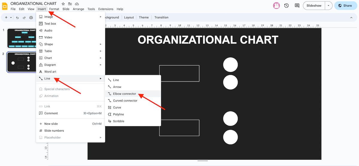
Using Connectors in the Organizational Chart
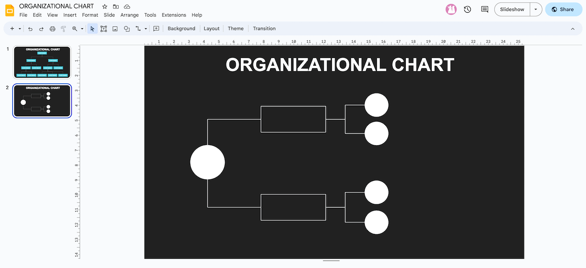
Step 1: Click Insert > Line > Elbow Connector. Use this command to connect the chart elements and showcase their relationship.
Step 2: Move the cursor over the main circle to bring an outline of violet dots.
Step 3: Click on any of the dots to generate a line and drag it to the corresponding dot of the first rectangle to represent the connection between the elements.
Step 4: Repeat this command to connect other elements of the third layer with those of the second using Elbow Connectors or straight lines.
Step 5: Use the option ‘Line color and Line weight’ to style the lines by selecting each line while holding the ‘Shift’ key.
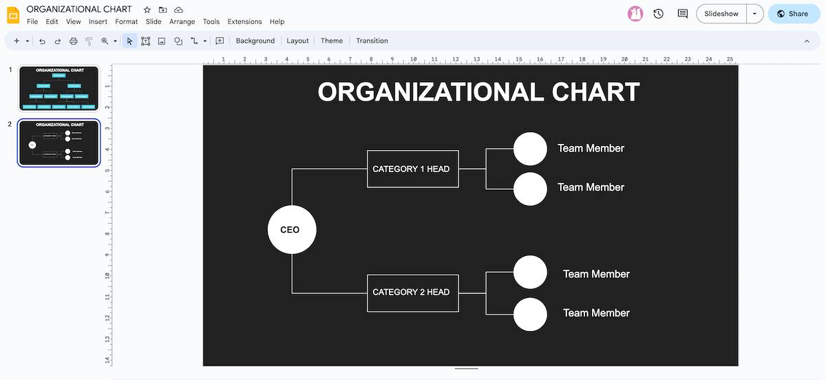
Adding Text in the Elements
Step 1: Double-click on a shape to bring up the text box and put your desired text.
Step 2: Change the font type, size, and text color as per your requirements, and don’t forget to align the text centrally.
High-five! You’ve learned this super easy way to create an organizational chart in Google Slides. Use it to nail your presentations, and stay tuned for more such handy guides!


