Do you understand the power of data for your business? It can help you grab new opportunities, drive organizational growth, make informed decisions, and enhance competitive edge. However, you must also be aware of the right visualization techniques to make data more useful, valuable, insightful, meaningful, and contextual.
The selection of the right chart or graph makes a huge difference on the audience’s understanding of your data. The right chart simplifies the complicated data, making it easy to interpret and comprehend. In contrast, a wrong one can lead to data misinterpretation, confusion, and bad decisions.
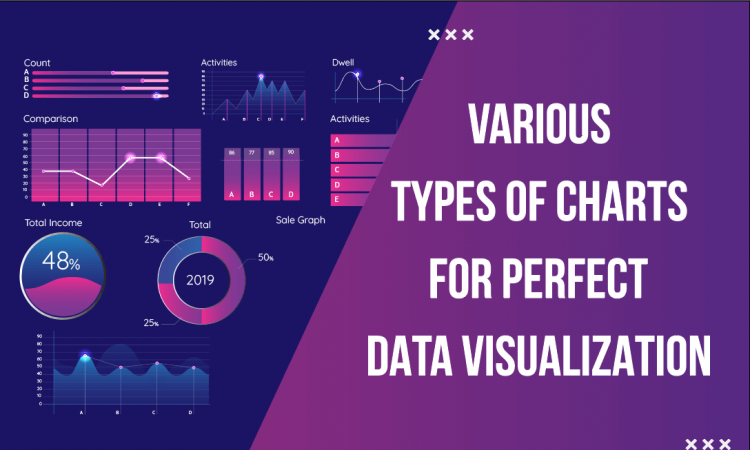
In this article, we will take you through the importance of data visualization and the relevant charts for showing specific data sets. Let’s begin!
Importance of Data Visualization
a). Simplifies Complex Information
The audience won’t be able to understand complex data if you present it without using graphs and charts. The rightly chosen visuals for data representation add a layer of comprehension and make information processing effortless.
b). Makes Raw Data More Insightful
Charts and graphs make raw data insightful. They show trends, patterns, and correlations between various data sets through distinct shapes, colors, and visual elements. Easy interpretation aids in quick and informed decision-making.
c). Makes Your Claims Persuasive
An effective data visualization adds persuasiveness and credibility to your arguments, analysis, and claims. It reflects your expertise as a presenter and builds trust with the audience.
Factors to Consider While Choosing Charts
(i). The Data Type
The selection of the chart depends on what kind of data you want to showcase. Remember, a single chart or graph can’t visualize all types of data. So, first determine whether you want to show trends, comparisons, or relationships between data sets.
For example, if your objective is to portray comparison, you can use a line or bar chart. But, if you want to depict distribution, use a histogram.
(ii). The Message
What do you want to convey to your audience through the graph/chart? What is the key point that you want them to remember? Do you want them to understand the meaning of the data or discover trends/patterns in data?
The answers to these questions will help you decide whether you should use narrative (e.g., line charts), explanatory (e.g., pie charts and bar charts), or exploratory (e.g., heat maps and scatter plots).
(iii). The Audience’s Needs
Understanding the preferences and requirements of your audience will help you choose the right chart/graph for your presentation.
Find out the answers to the following questions-
- Can they devote time for a detailed data visualization?
- Are your audience aware of the visualization’s context?
- Are they looking for additional information?
- The Presentation’s Aesthetics
Along with meeting the needs of data type, message, and audience, the chosen chart must also go well with your presentation’s design and aesthetics. So, check for relevance, consistency, accuracy, and clarity before finalizing the chart.
Relevant Charts to Visualize Different Types of Data
1. Line Chart

Line charts are the best visual aids for showcasing patterns in data, trends, variable changes, comparison of multiple data series, progression, correlations, and differences within data.
When to use?
Use them to illustrate:
- population growth, production cycles, and project timelines.
- analysis and predictions of opportunities and markets.
- comparison of sales for different services or products over time, etc.
Limitations
- The oversimplification of complex data sets conceals outliers.
- It can’t be used for displaying discrete or categorical data.
2. Scatter Plot

Scatter plots use evenly or unevenly distributed dotted points for visualizing data. These charts are easy to interpret, and the viewers don’t need to have extensive statistical knowledge to understand them.
When to use?
If you want to present a comparison of data values against two different variables on separate axes or correlations between variables and values, include a scatter plot in your presentation. You can also use these charts to demonstrate deviations or disproportionalities from the expected pattern or value.
Limitations
- Relationships or interactions between more than two variables can’t be presented precisely.
- Not suitable for showing comparisons between specific values or data points.
3. Bubble Chart

An extension of the scatter plot, a bubble chart exhibits relationships between more than two variables. The x-axis and y-axis represent two variables and the third (or multiple) variable is presented through distinctly colored bubbles. The size of these bubbles indicate the value of multiple variables (larger the bubble’s size, the higher the value).
When to use?
Use this chart to represent changes in large data sets over time and the influence of variables on each other. For example, the change in a specific stock price for a certain company over time can be presented with clarity using the bubble chart.
Limitations
- Not ideal for visualizing trends or comparison of two variables.
- Can’t be used for showing large datasets, as too many bubbles affect readability.
4. Donut Chart

Donut charts are the versatile variation of pie charts that are the best for showing multiple data series in an uncluttered manner. The varying color palettes make data visualization more engaging and appealing.
When to use?
Use it to illustrate the contribution of different categories to a whole and ratios of categorical data. A donut chart is the best visual aid for showing data in a limited space; that’s why it’s ideal for dashboards and presentations depicting business reports.
Limitations
- Not the best choice if you have to present negative values.
- As donut charts have static attributes, they can’t be used for showing real-time updates or constantly changing data.
- Don’t use it if you want to show more than 3-4 categories.
5. Pie Chart

A pie chart represents data in distinctly colored slices arranged in a circular form. Each slice depicts a proportion or fraction of the whole. The size of each slice points out the percentage of each category of the total count (whole), making analysis easy.
When to use?
Pie charts can be used to depict:
- the contribution of different marketing tools or strategies
- consumer behaviors
- sales data
- the percent of revenue/profit generated by different activities/departments during a specific time
- survey results
Limitations
Don’t use pie charts if:
- data can’t be converted into percentages.
- you want to showcase comparisons between different data sets.
- you want to depict data changes over time.
- the percentages of data categories are nearly equal.
- data has many possible values.
- the percentages add up to a value greater than 100.
6. Stacked Bar Chart

Stacked bar charts are used to showcase a data set’s composition. It depicts the relationship between individual elements/components and their collective total within a dataset.
When to use?
Use these charts to portray:
- changing trends.
- the referral, direct, and organic sources of a website’s traffic.
- sales distribution across various product categories.
- the composition of a region’s population.
- demographic distribution of different ages, ethnicities, and genders.
- budget allocation to different departments or project activities.
Limitations
- Not a perfect visual aid for presenting real-time shifts in trends.
- Can’t be used to visualize the comparison of the same data component through several categories.
- If the stacking has more than 4-5 layers or too many subcategories, it becomes difficult for the viewers to read.
7. Histogram

Histograms are used to visualize the distribution of sample data/dependent variables. It helps represent continuous range data and show the frequency distribution comparison of two data sets.
When to use?
Use histograms to show:
- the purchases made by different age-group customers.
- analysis of change over time
Limitations
- Histogram is a misfit if the data is non-numeric or the data points are fewer.
- Not the best choice if the data is undefined or missing.
8. Bar Chart

A bar chart displays discrete data categories through rectangular bars. The height/length of each bar represents the corresponding category’s value. It represents the categories on one axis and discrete values on another axis.
When to use?
Bar charts can be used to display:
- a comparison of metric values across distinct data subgroups.
- a distribution of data points.
- troughs, peaks, and patterns in the data over a long period of time.
Limitations
- You can’t provide in-depth information about individual data points within each category.
- Not suitable for representing continuous data, such as time or temperature.
- Avoid using these charts if the sample size is large.
- These charts can’t display multivariate data.
9. Cockpit Charts

Cockpit charts can be used to represent data related to a project performance in a visually impressive manner. It helps display scattered data in a structured and compact manner.
When to use?
These charts are suitable for showing:
- performance metrics, such as financial KPIs, website traffic, sales numbers, etc.
- a unified view of data across functions.
- progress over time.
Limitations
- It shows high-level metrics; however, it doesn’t depict the finer details of data.
- Not helpful for complex analytics or deep data exploration, as it focuses on ‘what’ happening, not on ‘why’ happening.
10. Pareto Chart

A Pareto chart comprises bars in descending orders representing individual values and a line showing the collective total of the individual values.
When to use?
Use this chart to display:
- qualitative data
- priority focus areas in process improvement.
- the frequency of defects or problems in a process.
- the products that generated the highest sales.
Limitations
- It doesn’t display variability, standard deviation, averages, and other quantitative data.
- Not appropriate if you want to visualize the changing nature of factors or the distribution of continuous variables.
11. Ramp Chart

Include a ramp chart in your presentation if you want to show growth stages, progression, gradual increase of a metric over time, etc. This chart comprises a diagonally ascending ramp segmented into many sections in different colors.
When to use?
Use this chart to display:
- the progress of a project, product, or process.
- sales/revenue growth over a specific time.
- increase in product adoption after marketing campaigns.
- increase in units produced per month.
- operational efficiency improvement after technological upgrades.
Limitations
- This chart provides an oversimplified view of growth without highlighting unexpected delays, fluctuations, and complexities.
- It does not furnish details of phases or milestones, making it difficult for the audience to understand when transitions occur.
- Not well-suited to showcase declines and non-linear growth.
12. Gantt Chart

This chart is useful for visualizing the key details of a project, such as tasks, timelines, deliverables, resource allocation, etc. It helps project managers keep all the team members and stakeholders aligned.
When to use?
These visual aids are a perfect choice for illustrating:
- the progress of tasks of a specific or multiple project(s).
- critical metrics, milestones, deadlines, and deliverables.
- potential risks or constraints in a project.
Limitations
- It does not portray task dependencies.
- Visualization of information becomes complex for projects with many tasks and subtasks.
- Needs to be constantly updated.
13. Venn Diagram

A Venn diagram is a representation of logical relationships between data sets. The overlapped parts of circles show commonalities, while non-overlapped parts point out differences between things or groups.
When to use?
Use it to present:
- comparison and contrast between two or more data sets.
- similar and distinct features of two or more products of the same or different companies.
- subsets, intersections, and unions (in mathematics)
Limitations
- Not a good choice for showing dependent or conditional relationships between data sets.
- Complex intersections and relationships between many subgroups can’t be clearly represented.
14. Radar Chart

A radar chart is a two-dimensional graphical representation of three or more quantitative variables on axes beginning from the same point. A line connects all data points, forming a polygon.
When to use?
This chart is a perfect visual aid for displaying:
- multivariate observations.
- comparison of the performance of companies, individuals, and products across cost, quality, revenue, and other metrics.
- comparison of project options on the basis of resource allocation, cost, risk, duration, etc.
Limitations
- Portraying a comparison of non-adjacent variables is difficult through this chart.
- It provides limited insights into absolute values or performance.
- Not the best choice for datasets with many variables.
15. Heatmap

Heatmaps use a table or matrix with different colored cells to show trends and patterns in data. The lighter color shows lower values, while darker colors represent higher values.
When to use?
Incorporate heatmaps into your slides to depict:
- user behavior on specific web page(s).
- per-capita income, population density, and average temperature in various cities of a state.
- the level of risks and priority focus areas.
Limitations
- Ideal for showing two-dimensional data, not higher-dimensional data.
- Not well-suited for presenting precise data points.
- The correct interpretation highly depends on color gradients.
16. Sankey Diagram

Sankey diagrams portray the flow of resources (cost, energy, material, etc.). Each flow’s beginning and endpoints are called nodes, and the path between them is called a link. The width of the link denotes the flow rate (high width indicates high flow, or vice versa).
When to use?
Sankey diagrams are a good choice for visualizing:
- material flow analysis
- change or movement from one state to another
- cost breakdowns
- inputs and outputs
Limitations
- It focuses on the flow, not on process efficiency.
- Not suitable for presenting dynamic changes.
- Interpretation becomes difficult when the flow is complex (too many nodes and flows).
Conclusion
An impactful data visualization hinges not only on data relevance and accuracy but also on the choice of the right chart that makes it easily readable and comprehensible.
When deciding which chart to incorporate into your presentations, answer a question – what do you want to communicate with your data? The answer will help you make the right choice!


