Actual Vs Forecast Infographic Presentation
Actual Vs Forecast Infographic Presentation
(7 Editable Slides)

Related Products

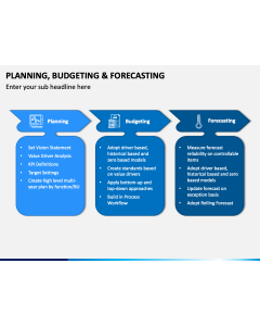


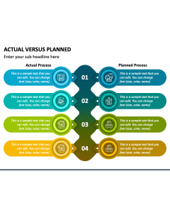
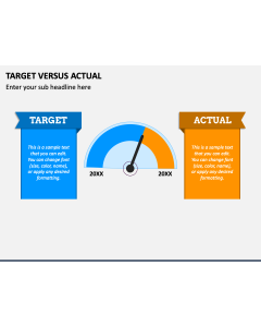
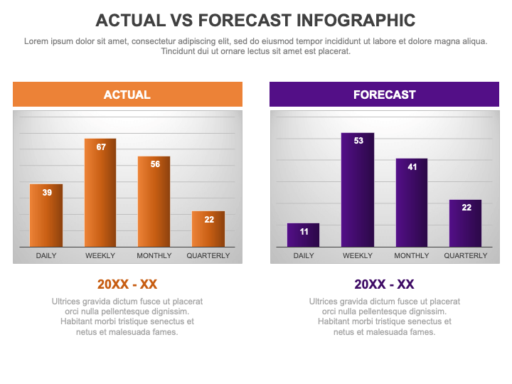
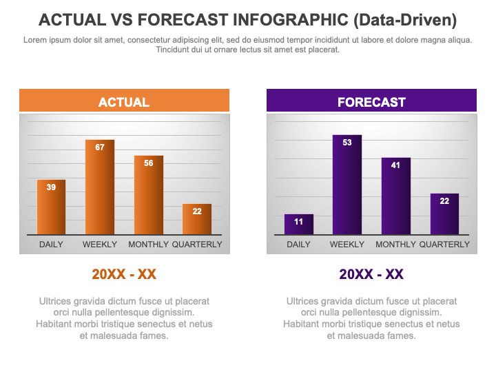
Download our Actual vs. Forecast Infographic for PowerPoint and Google Slides to communicate your message in an organized manner and ensure easy comprehension. Financial experts can use this deck to highlight the comparison of actual financial results with forecasted outcomes, exhibiting the key drivers of financial performance. Project managers can utilize this versatile set to depict the difference between the actual project timeline and the initially forecasted schedule. Digital marketing managers can make the most of these multipurpose visuals to display actual website traffic, user engagement, and conversion rates compared to forecasted numbers. Additionally, you can exhibit the actual market trends with forecasted projections, customer satisfaction scores against the forecasted targets, etc.
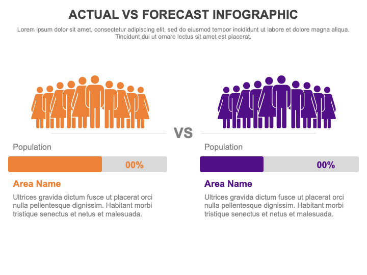
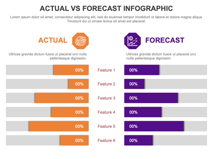
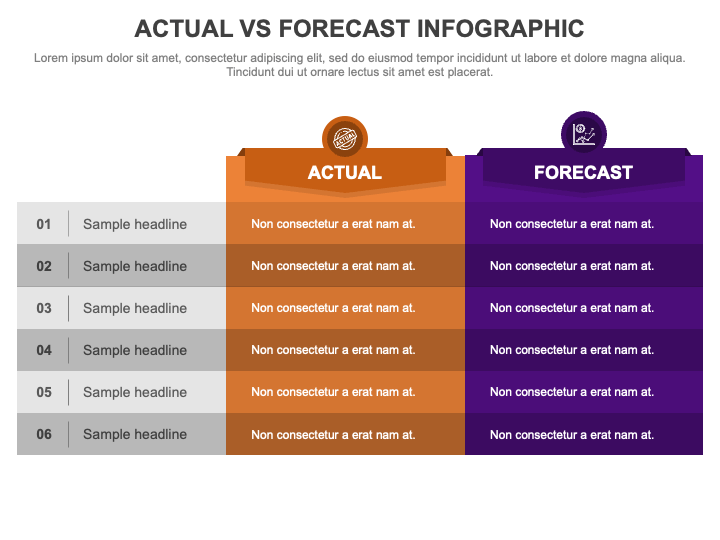
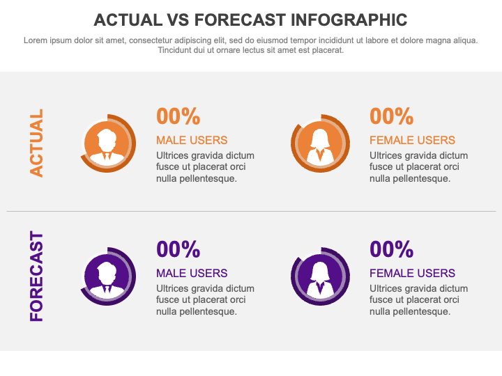
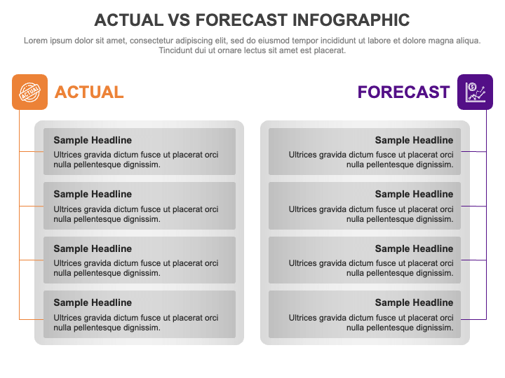
The template features a demographics layout, table infographics, and bar graphs. The visuals are adorned with bold color contrasts, appealing icons, and editable text placeholders.
Features
- You can make the desired changes to suit your preferences without prior editing knowledge or external assistance.
- Projecting the graphics on any screen dimension won’t disturb the optical resolution or quality.
- The design process involves thorough research to avoid copyright issues.
Download this PPT to give your presentations an appealing look!