Annual Gantt Chart PowerPoint and Google Slides Template
Annual Gantt Chart PowerPoint and Google Slides Template
(6 Editable Slides)


(6 Editable Slides)
Related Products


Do you think your audience finds it hard to understand complex figures and diagrams? Well, now you can make them understand your content in a simpler manner using this Annual Gantt Chart PPT template. It will let you grab their attention and make them understand the detailed annual timelines of different entities in a seamless way.
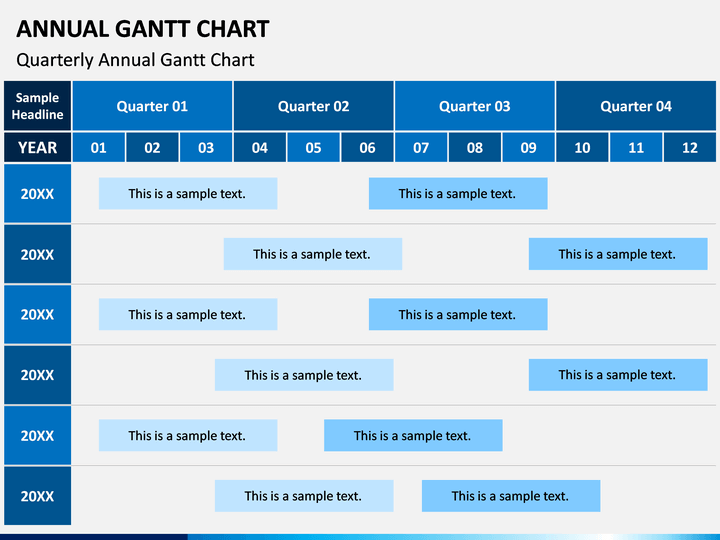
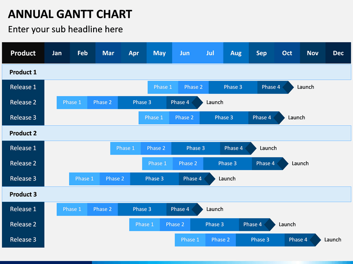
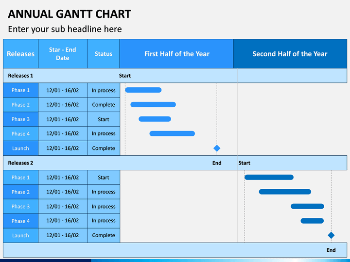
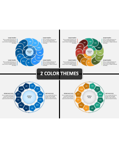
About Gantt Charts
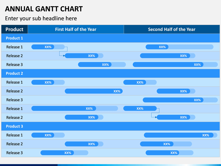
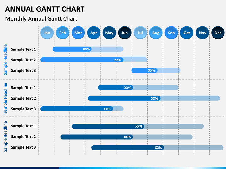
Named after Henry Gantt, it is a popular visual representation tool that provides a view of any task over schedule/time. It is majorly used to provide the timelines of various projects or tasks with respect to time in one place. Therefore, it can help us study the dependency or any other relationship between tasks (for instance, whether they will overlap). The Annual Gantt Charts are mostly used to provide the breakdown structure of work for a year. The distribution can be laid for monthly, quarterly, or any other duration.
Major Features
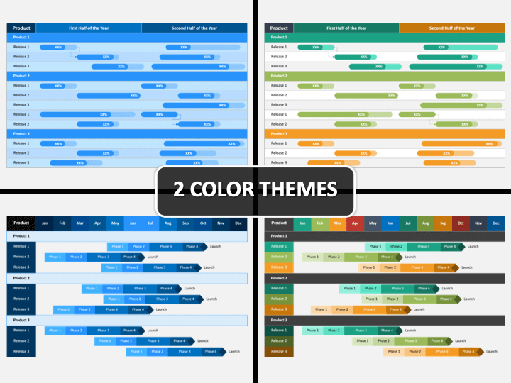
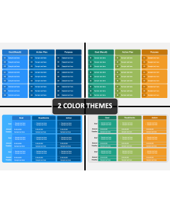
- This is a professionally drafted set that consists of various designs of Gantt charts that are drafted to provide the breakup of work for a year.
- You can readily use these vectors to showcase the progress of your projects for months, quarters, and so on pretty easily.
- Since these illustrations are vector-based, you can easily customize them and add your content without facing any trouble.
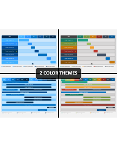
- The presentation set is available in different color themes to make it easier for us to edit it.
- All these vectors are compatible with MS PowerPoint, Apple Keynote, and Google Slides.
Who can Use it?
This set can be extremely useful for project managers, team leads, business strategists, consultants, marketing experts, and related professionals. Ideally, any individual who would like to explain the progress of their work or projects over a year will find this set useful. It will help you save your time and impress your audience as well.
How to Use it?
You can use these illustrations with your preferred application like Microsoft PowerPoint, Apple Keynote, or Google Slides. Using their native features, you can add your content and even change the appearance of these slides. All these vectors come in different color themes, which will make your job easier than ever.