


Similar Products
- Sale

- Sale
- Sale
- Sale
- Sale
- Sale


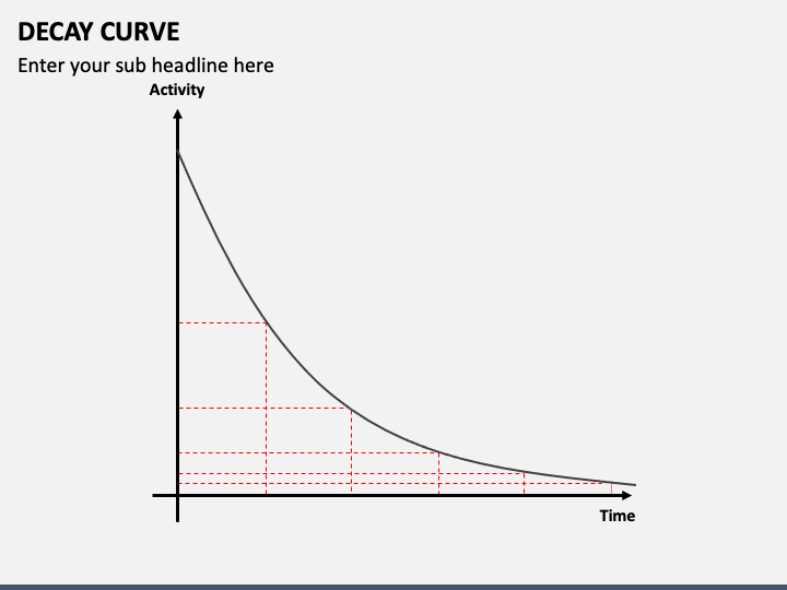
We have brought you the Decay Curve PowerPoint and Google Slides template to help you showcase a gradual decline in measurable quantities across different industries. Product managers can use stunning graphics to showcase the decrease in the product’s popularity, sales, or market share over time. Educators and researchers can use this set to portray aging populations, declining birth rates, factors impacting migration, and much more. Software developers can use these visuals to highlight reasons that cause software or hardware performance degradation.
The compelling visuals with appealing color combinations are the perfect visual resources to convey a chunk of information in easily digestible snippets and help the audience retain the key takeaways for longer.
A Quick Look at Slides’ Design
- The applications of decay curves are showcased via a beautiful graphic.
- A graph illustration depicts a brief overview of the decay curve.
- The key reasons why decay curves are valuable are highlighted comprehensively.
Features at a Glance
- You don’t need special tools or prior editing experience to modify the deck elements.
- The high-definition graphics look the same on all screen dimensions.
- Everything has been thoughtfully designed to ensure no user experiences copyright issues.
- Our support executives are approachable 24*7 to resolve your queries immediately.
Write Your Own Review

Related Products


