Data Driven Charts
PowerPoint Data Driven Charts
In the world of interconnected devices where businesses are operating in a data-driven environment, it is crucial to represent the numerical data to the intended stakeholders aptly and in a well-organized manner for facilitating quick decision-making. Here our entirely editable Data Driven Charts PowerPoint templates are quite useful to illustrate your valuable statistical information in a visually impressive manner and encourage the audience to derive actionable insights from it.
All the elements of the decks have been prepared with the utmost precision and great attention to detail. Since the decks are pre-designed, you are not required to invest your valuable time and exert effort in designing them from scratch. All you need to do is, customize them according to your data, and you are all set to deliver an engaging presentation. So, download them now!
Read More
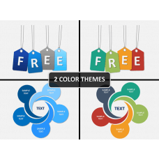
- Free

- Sale
- Sale
- Sale
- Sale
- Sale
- Sale
- Sale
- Sale


PPTs Useful for All Professionals
Professionals from all walks of life, i.e., business, finance, education, research, etc. can use these creative templates to make their information standout and create a compelling impression on the audience.
Entrepreneurs and Startup Owners
For illustrating:
- executive summary
- financial data, such as cash flow, revenue generation, profit margin, net income, gross profit, etc.
- exchange rates, market share, etc.
- data with uncertain future values
- performance of different business units, etc.
Project Managers
For representing:
- levels of risks associated with projects or specific tasks of a project
- project status like the ongoing activities, on-hold tasks, overdue milestones
- data projections and percentage comparisons, etc.
Marketing Managers
For demonstrating:
- the latest and future market and technology trends
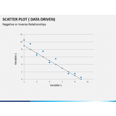
- relationship between variables
- traffic and conversions against time
- comparison of relative performance based on feasibility studies and customer feedback surveys
- website traffic to lead ratio, cost per lead, customer lifetime value, MQL to SQL ratio, etc.
Sales Managers
For representing:
- sales KPIs (key performance indicators) status and reports
- trends for future data on the basis of a single value from the past
- survey and data analysis reports, etc.
- sales by territories and countries, etc.
Human Resource Managers
For showcasing:
- the total compensation, salary, bonus, commission, etc. of employees during a specific time period
- the percentage of employees in the organization by gender, age group, location, and department
- compensation distribution by location and department
- the percentage of employees hired and left in a year, etc.
Salient Features
- The graphs in our decks are linked to excel. Excel will pop up when you right-click on the graph/chart and click on Edit with Excel. Insert your data there, and the graph will get automatically adjusted.
- The illustrations are entirely customizable. You can easily recolor and resize the charts to match your presentation’s theme and tone. You don’t need to have years of experience in designing to make edits.
- All the slides have been designed with a separate file to make them compatible with Microsoft PowerPoint, Apple Keynote, and Google Slides.
- The high-definition and vector-based graphics ensure flawless resolution on screens of all sizes.
- You will not encounter issues related to copyright.
- Use the sets for the entire life by downloading them once.
Many enterprises use these visually interactive dashboard slides to demonstrate their boring stats in a meaningful and captivating way. So, you should not lag behind; make a quick move and download the Data Driven Charts PPTs right away!

Diagram Finder